The play of opposites in Eiffelgres’s Pillart porcelain stoneware collection reveals the power of design to direct the viewer’s eye toward captivating subjective interpretations. The visual balance created by the ceramic surface is conveyed in the positive and negative modes of the same matrix.


In the visual contrast between opposite elements the designer lays the foundations for setting up the sensorial and emotional relationship that will be triggered between the product and the people who use it.
The starting variables are therefore essential for the personal choices of users, who instinctively seek to establish a balance between the compositional forces in play. This initial impression is now based on experience of a much wider range of images than in past decades.
The aim of achieving this kind of balance, postulated by Bruno Munari more than 40 years ago (Design e comunicazione visiva, 1968), is important because it makes us immediately aware of the communicative potential of the objects and places we live in, and above all defines our own personal interpretative space. And so analysis of simple forms allows us to glimpse the outlines of more complex shapes, and vice versa.
These passages seem particularly clear in porcelain stoneware collections such as Eiffelgres? Pillart collection: in the positive and negative modes, the ceramic surface becomes a space in which the architect brings together opposites or pushes them apart, coming up with a number of attractive solutions.
The play of opposites thus contains combinations and absences of colour, unexpected positions, an alternation of full and empty volumes, abstract modules and aspects of vivid concreteness which are merely perceived or underlined by contrast, intentionally left in the background or forcefully underlined.
This form of design gives free rein to the imagination and assigns meanings, essential subjective elements which we are constantly using in the field.
Marco Privato
Captions
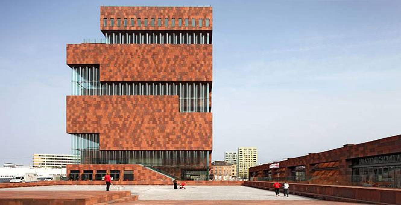
01_Museum Aan De Stroom (Antwerp Museum). Hanzestedenplaats, Antwerp (Belgium). Design: Neutelings Riedijk Architects, 2010. Photo credits: © Sarah Blee, Scagliola/Brakkee, Filip Dujardin
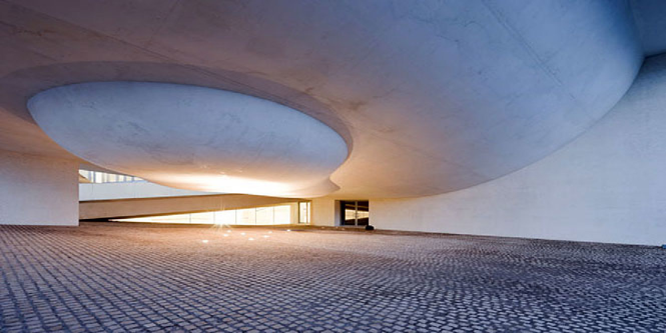
02_Cité de l’Océan et du Surf, Museum of the ocean and surfing. Biarritz (France). Design: Steven Holl Architects (Solange Fabião, Steven Holl) + Agence d’Architecture X.Leibar JM Seigneurin, 2011. Photo credits: © Iwan Baan, Steven Holl Architects
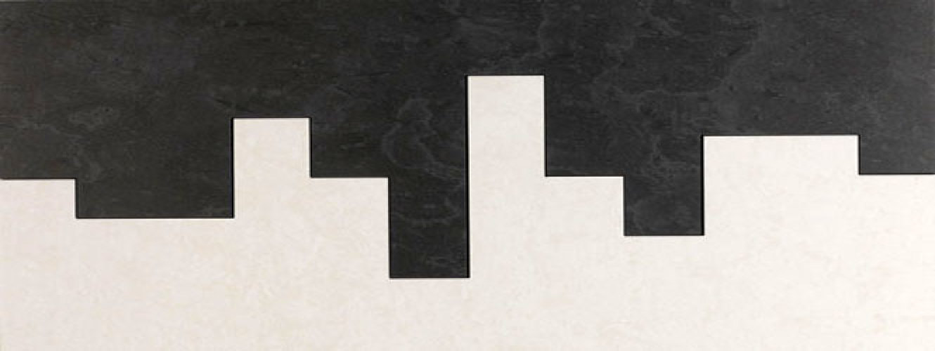
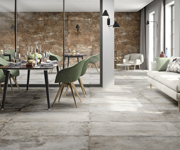
03_Eiffelgres - Pillart collection - positive; inspired by the Norwegian slate known as Pillarguri. Mauro Bellei, 2012.
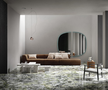
04_Eiffelgres - Pillart collection - negative. Mauro Bellei, 2012.
05_Eiffelgres - Pillart collection - negative, detail. Mauro Bellei, 2012.
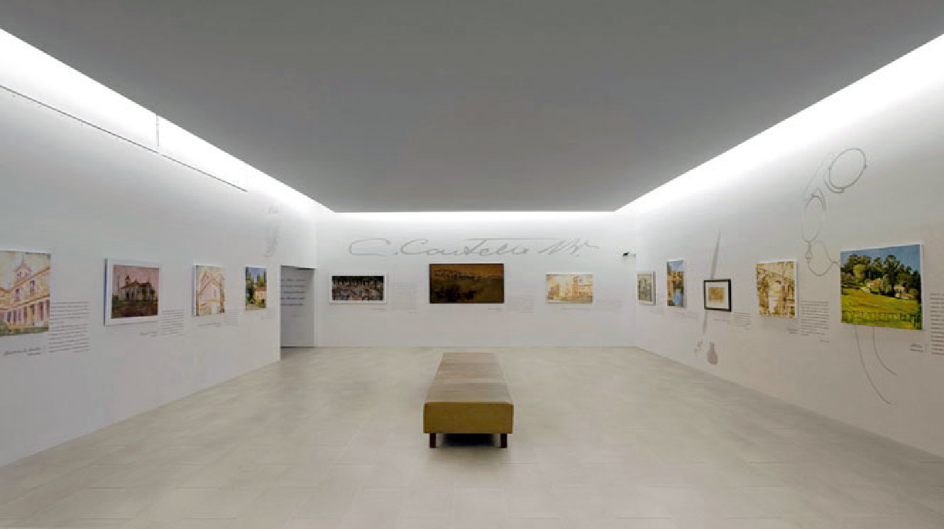
06_Impressions, Photo by Massimo Fabris, 2012.
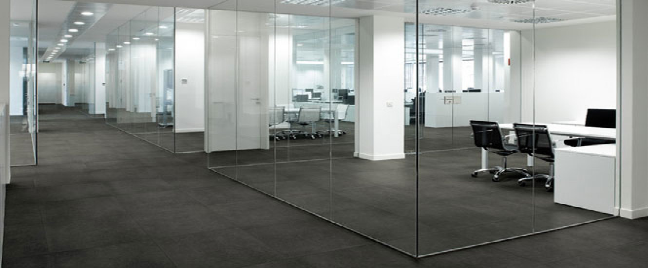
07_Eiffelgres ? Pillart collection. Mauro Bellei, 2012.
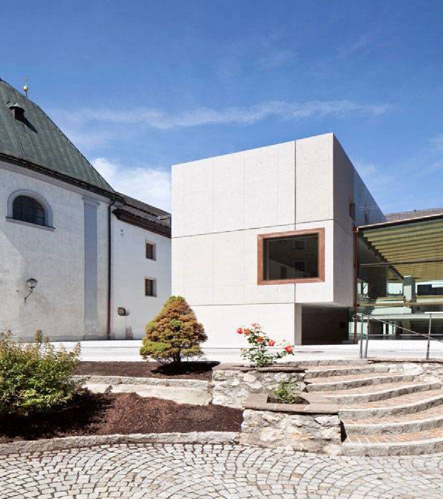
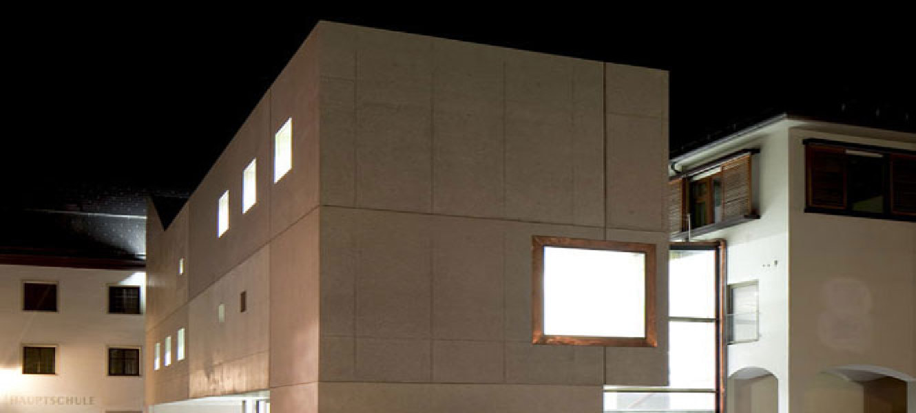
08_School building in Rattenberg (Austria). Design: Daniel Fügenschuh, 2010-’11. Photo credits: © Christian Flatscher
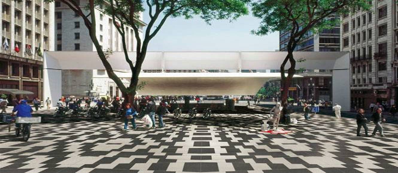
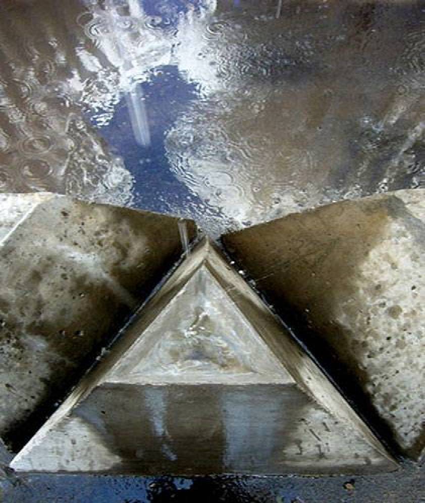
09_Water Cathedral, Santiago de Chile. Design: GUN Architects, Jorge Godoy and Lene Nettelbeck, 2011-’12. Photo credits: GUN Architects and Guy Wenbourne, courtesy of CONSTRUCTO
10_School building in Rattenberg (Austria). Design: Daniel Fügenschuh, 2010-’11. Photo credits: © Christian Flatscher