In the Stonepeak collections, the colours of porcelain floor and wall tiles permit combinations that underline the sensorial and expressive aspects of our design with equal intensity.


The choice of colours for porcelain floor and wall tiles is always the product of much consideration and special attention: it depends on the use of the space (for home, work or entertainment), the furnishings and the overall atmosphere in the building.
But the final composition is rarely the result of rational, carefully weighed assessment, either in large-scale architectural projects or in minor everyday home restyling jobs.
The choice of colour is in fact influenced by many sensorial, cultural and psychological experiences, which lead us to prefer a particular solution over another, as all theories of colour associated with design and art revealed decades ago.
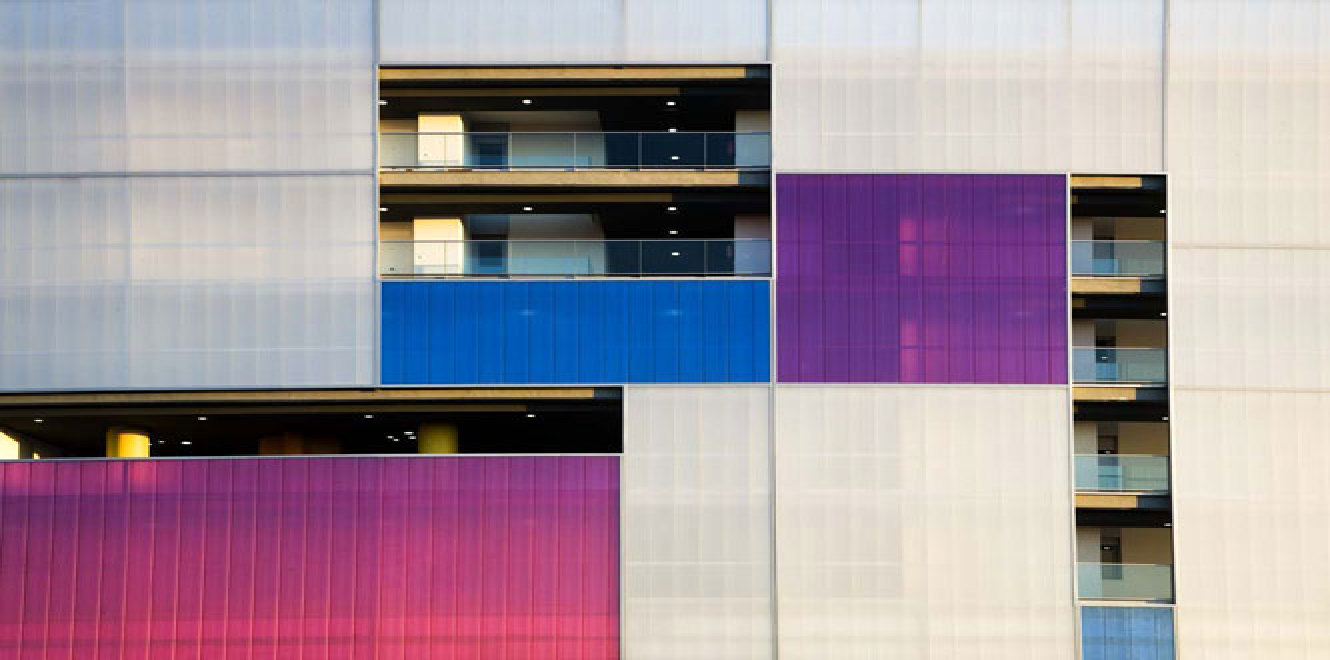
Warm colours, neutral hues, gradations or black and white textures: in compositions with porcelain tiles for floors and walls, the chromatic result is, in the end, always personal and unique.
When we combine two or more colours, for instance, we can do it harmoniously or by seeking contrasting effects to emphasise particular objects, corners of the home or parts of the furnishings; we can use light spots in the room to tone down or accentuate the natural veins in the stone; we can seek external cladding that fits into the context of the open spaces around the home to ensure visual continuity.
The many implications of colour ensure that it is never a secondary aspect of a project, but always a key factor.
The natural variety of Stonepeak porcelain tiles allows us to draw on these sensorial aspects to obtain an unending variety of highly expressive personal compositions.
Careful selection of materials ensures that each individual colour has its own power, in both monochromatic designs and in combinations with other colours, creating atmospheres which can easily change in different circumstances: from classic elegance to dynamic and transitional spaces, from intimate family spaces to meeting-places for the community.
Marco Privato
Captions:
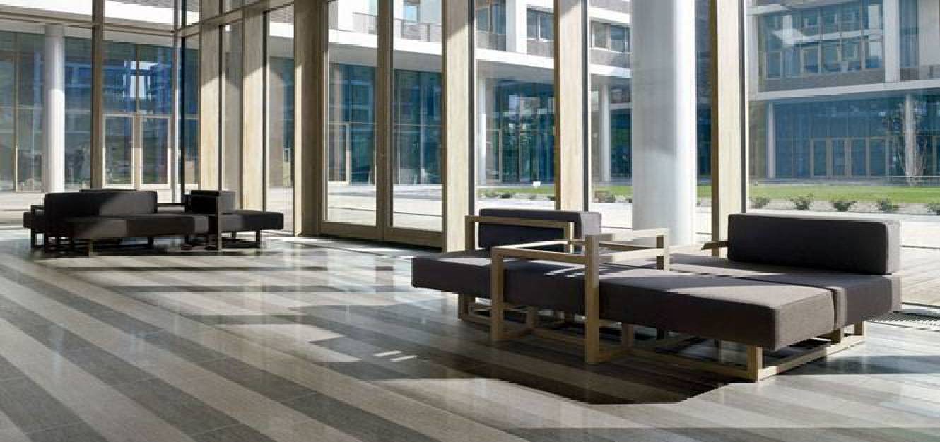
01_Stonepeak Ceramics, Materia 3d collection, available in 5 colours: pearl, sisal, platinum, heather grey, leather
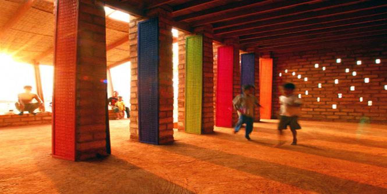
02_Sra Pou vocational school, Cambodia. Design: Rudanko-Kankkunen Architects. Photos: Architects Rudanko-Kankkunen
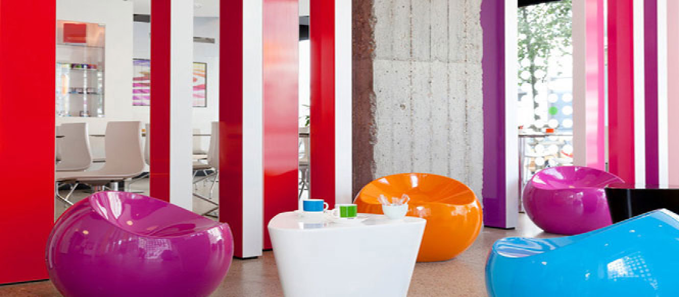
03_Pantone Hotel, Brussels. Courtesy of Pantone Hotel. Photos: Sven Laurent.
04_Bioclimatic apartments, Móstoles Sur, Madrid, Spain. Design: Ruiz-Larrea & Asociados. Photos: © Ángel Baltanás
05_Bioclimatic apartments, Móstoles Sur, Madrid, Spain. Design: Ruiz-Larrea & Asociados. Photos: © Ángel Baltanás
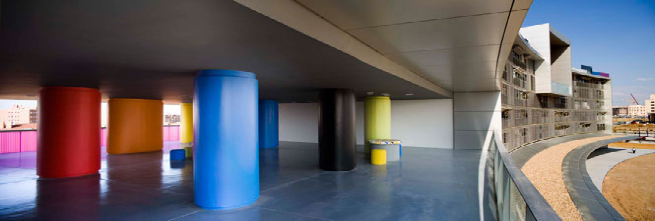
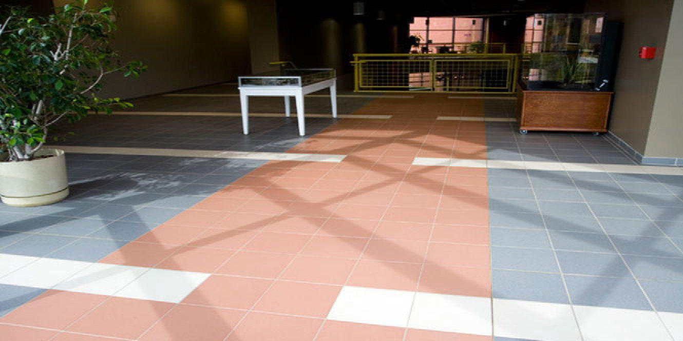
06_Natural History Museum, Gray, Tennessee. Stonepeak floors. New Basics collection, in the colours nickel, quartz, frost, red clay
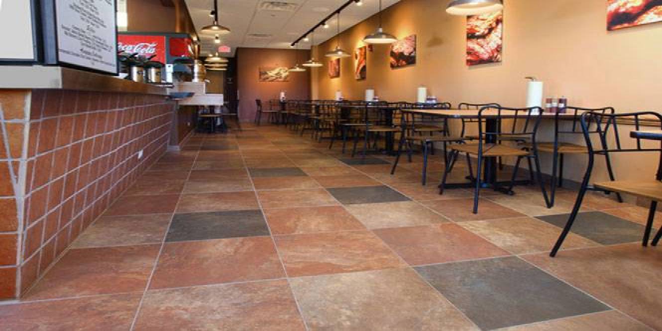
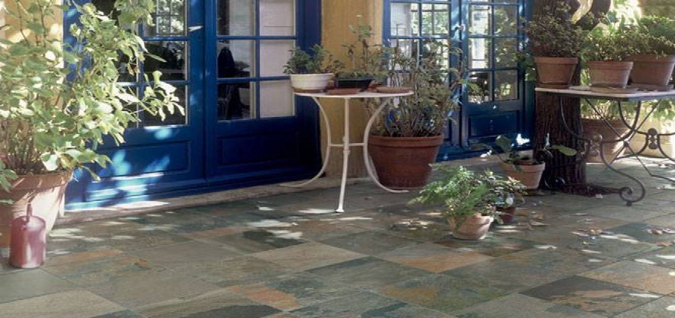
07_Smokin t’s Bar-b-que, Long Grove, Illinois. Stonepeak floors. Slate collection, in the colours everglades and lava
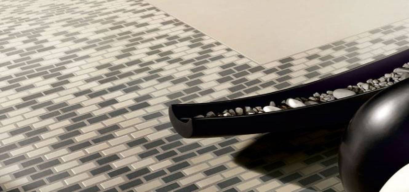
08_Stonepeak Ceramics, New Mosaics collection, available in 5 colours
09_Stonepeak Ceramics, Raja collection, available in 3 colours: himachal white, vijay sand, kund multicolor
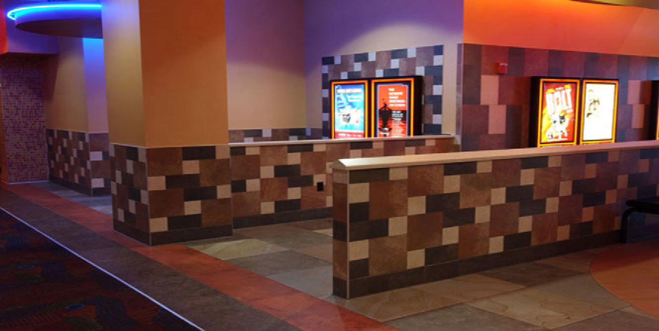
10_Regal Cinema, Albany, New York. Stonepeak floors. Slate collection, in the colours clay, everglades and lava