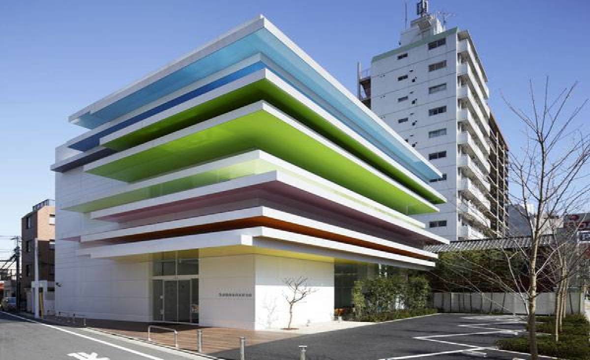
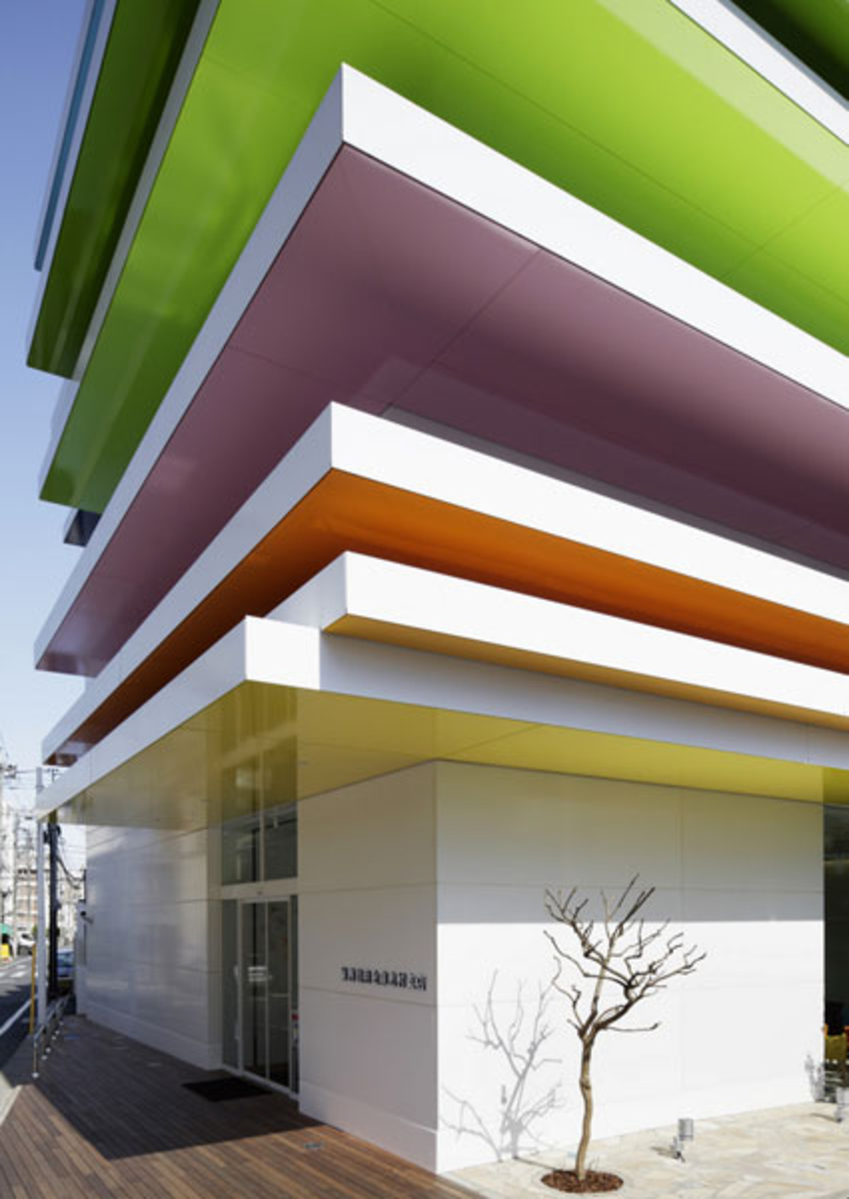
Architect Emmanuelle Moureaux’s plan for a bank branch is a lively game of colours and references to nature.


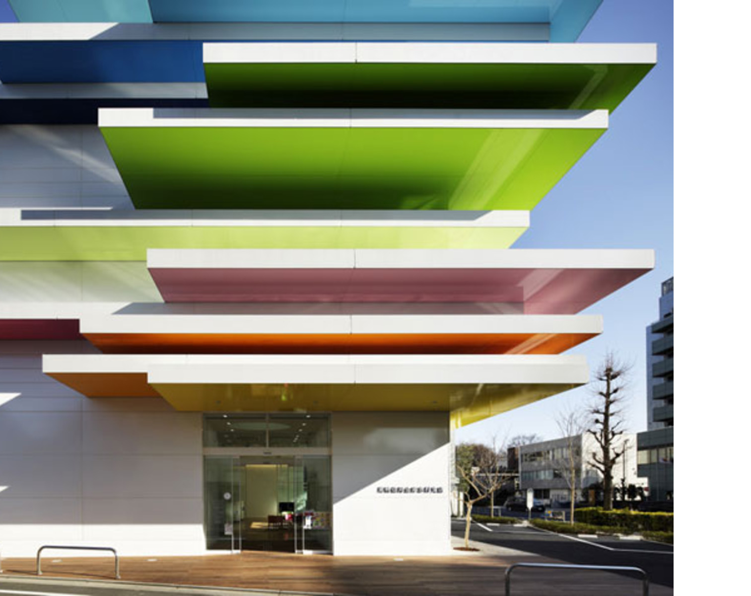
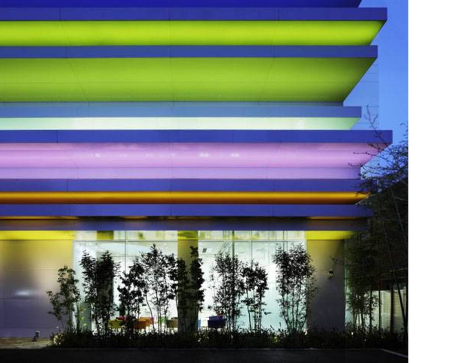
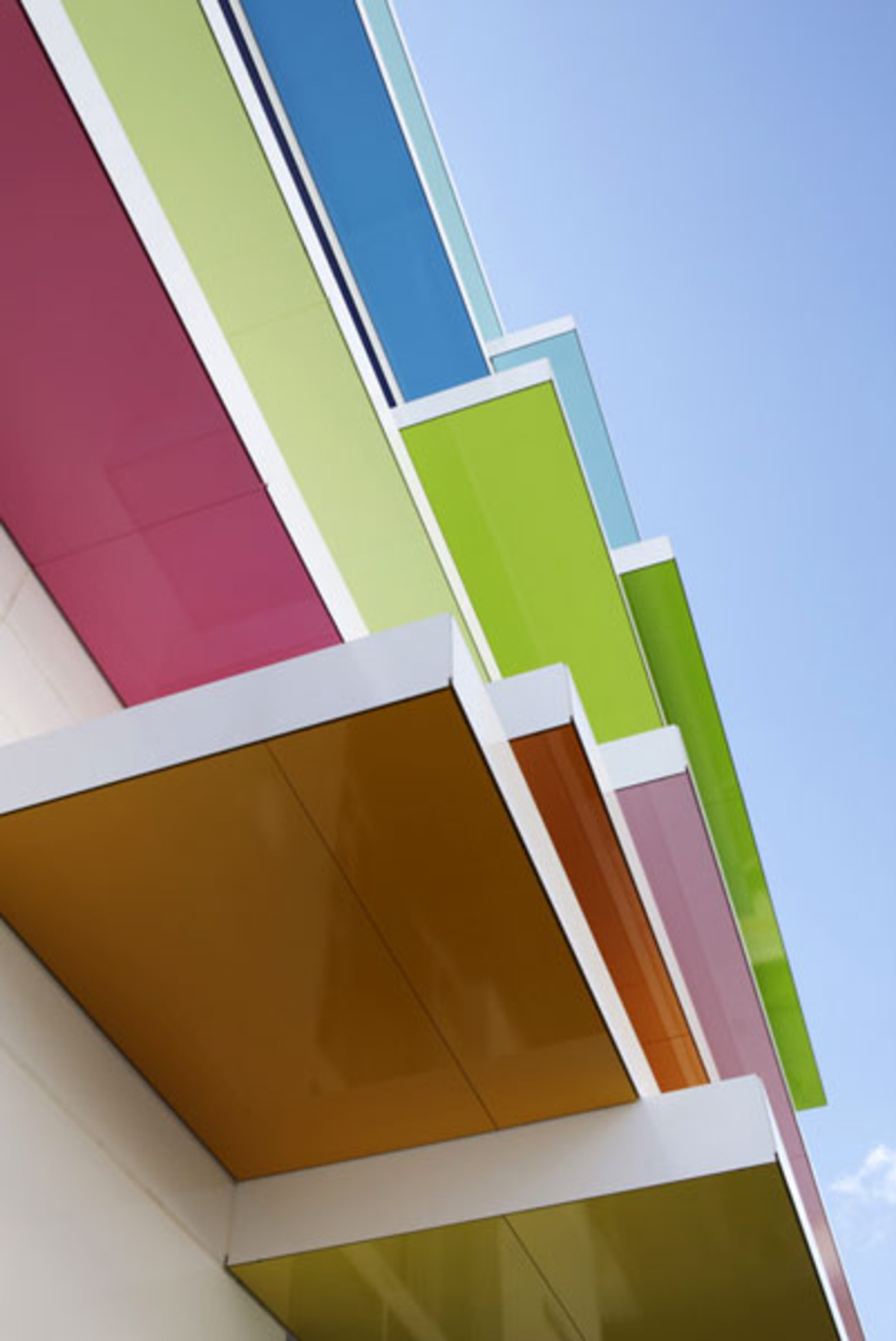
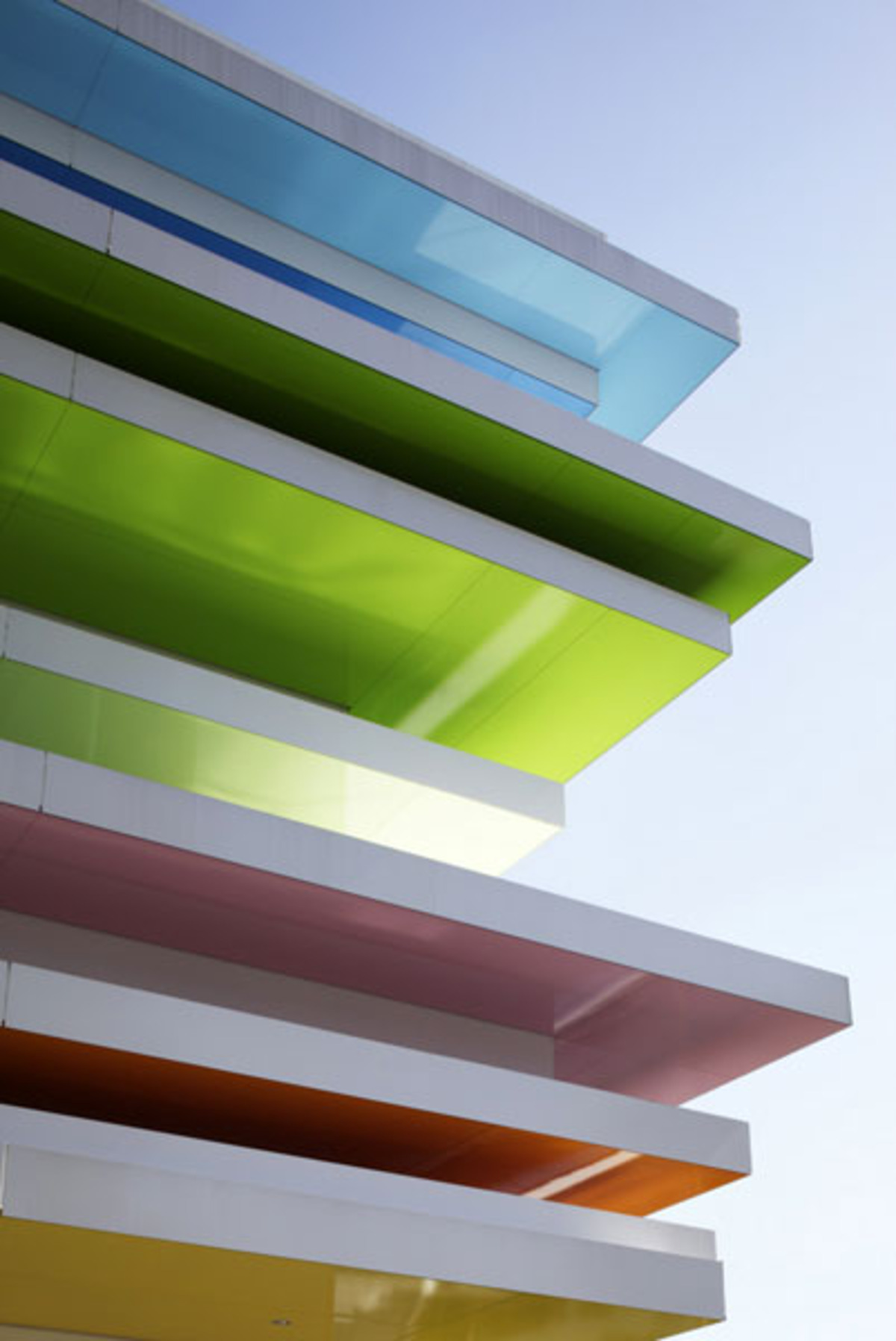
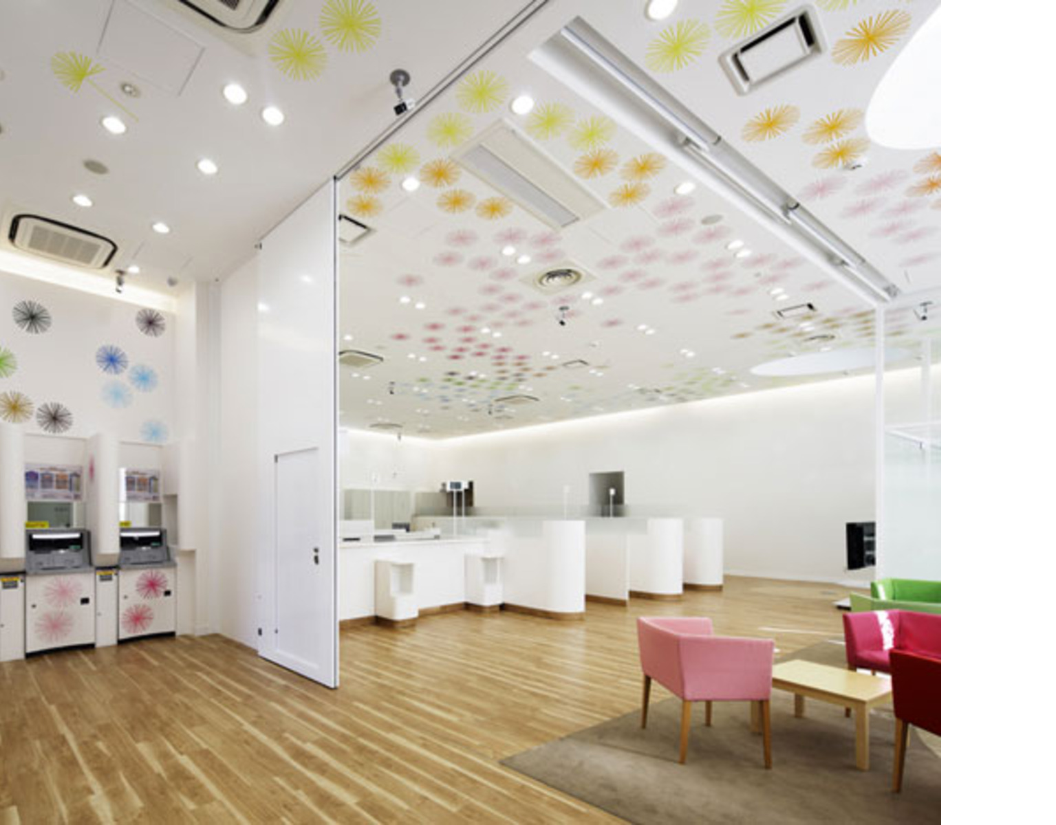
") The building designed by architect Emmanuelle Moureaux is a simple volume cut by white aluminium floors with coloured undersides which prepare the visitor for the feelings of joy and happiness inspiring the entire construction.
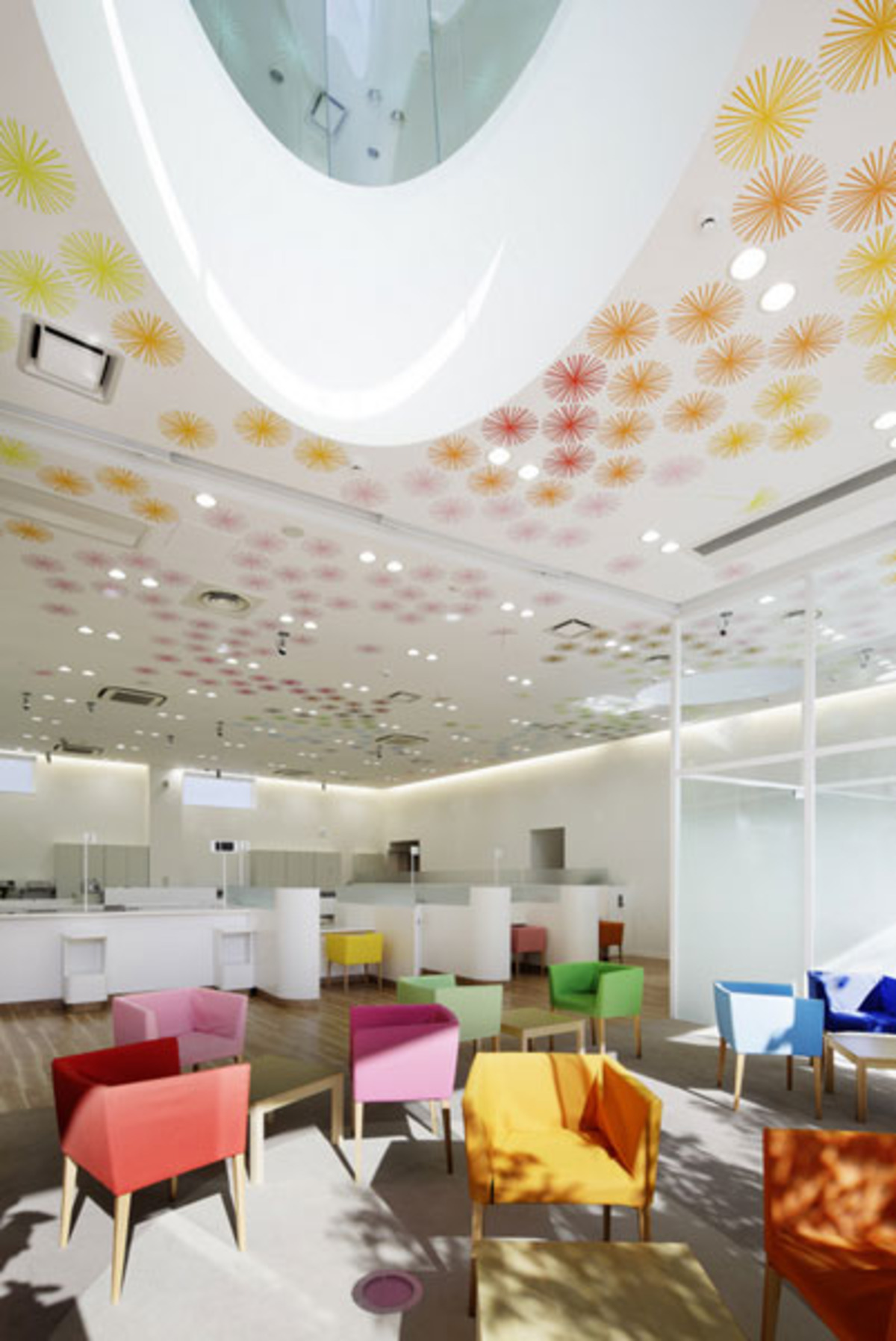
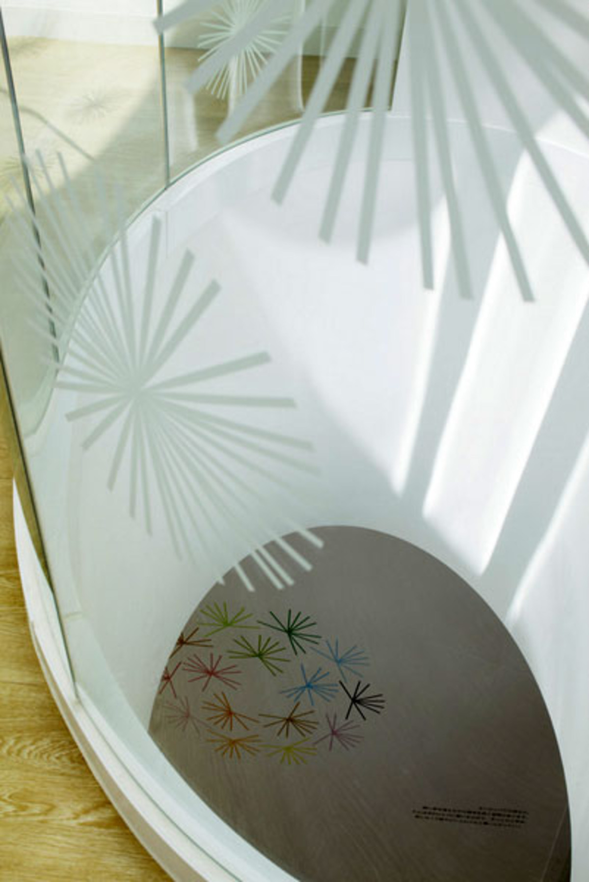
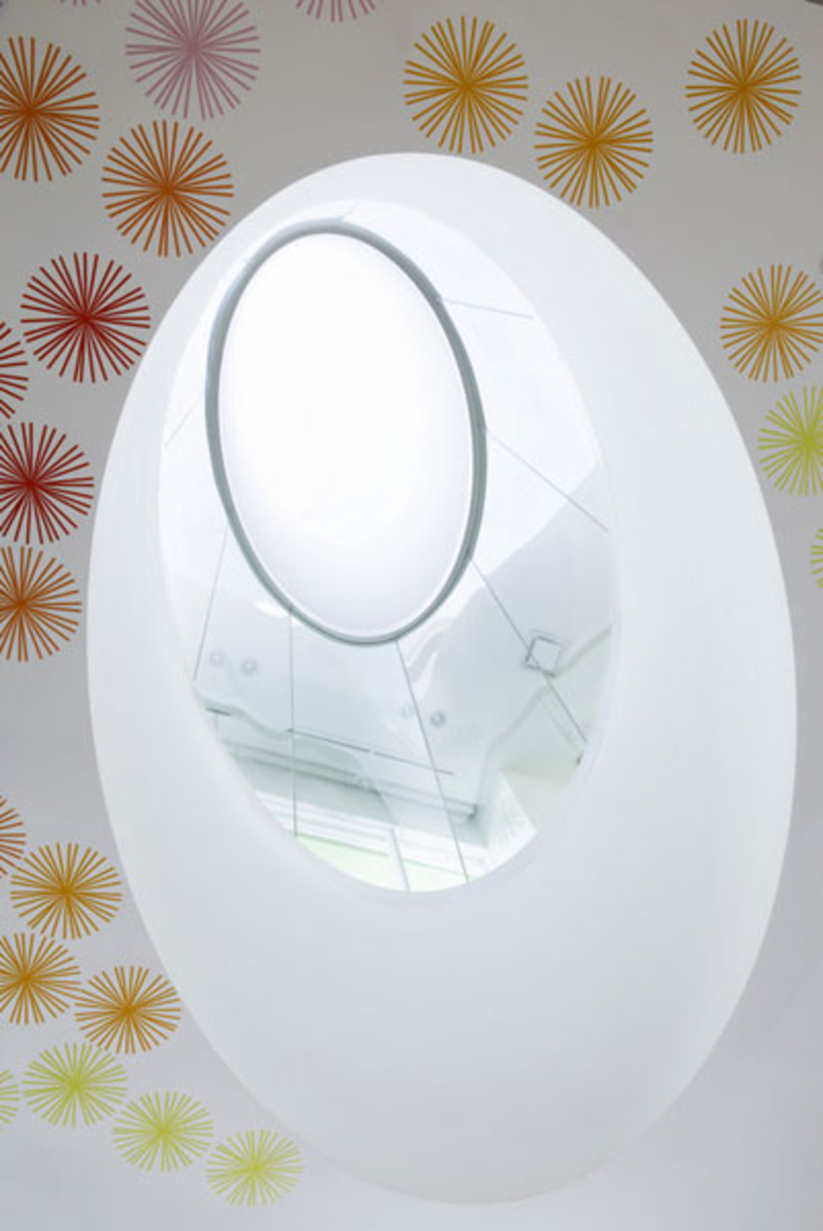
The building designed by architect Emmanuelle Moureaux is a simple volume cut by white aluminium floors with coloured undersides which prepare the visitor for the feelings of joy and happiness inspiring the entire construction.To translate into architecture the client?s motto, which states that the bank serves “happy customers”, the architects play with 12 different bright colours used in the interior for the furnishings and decorative graphics featuring coloured flowers and petals sprinkled over the walls and ceiling.
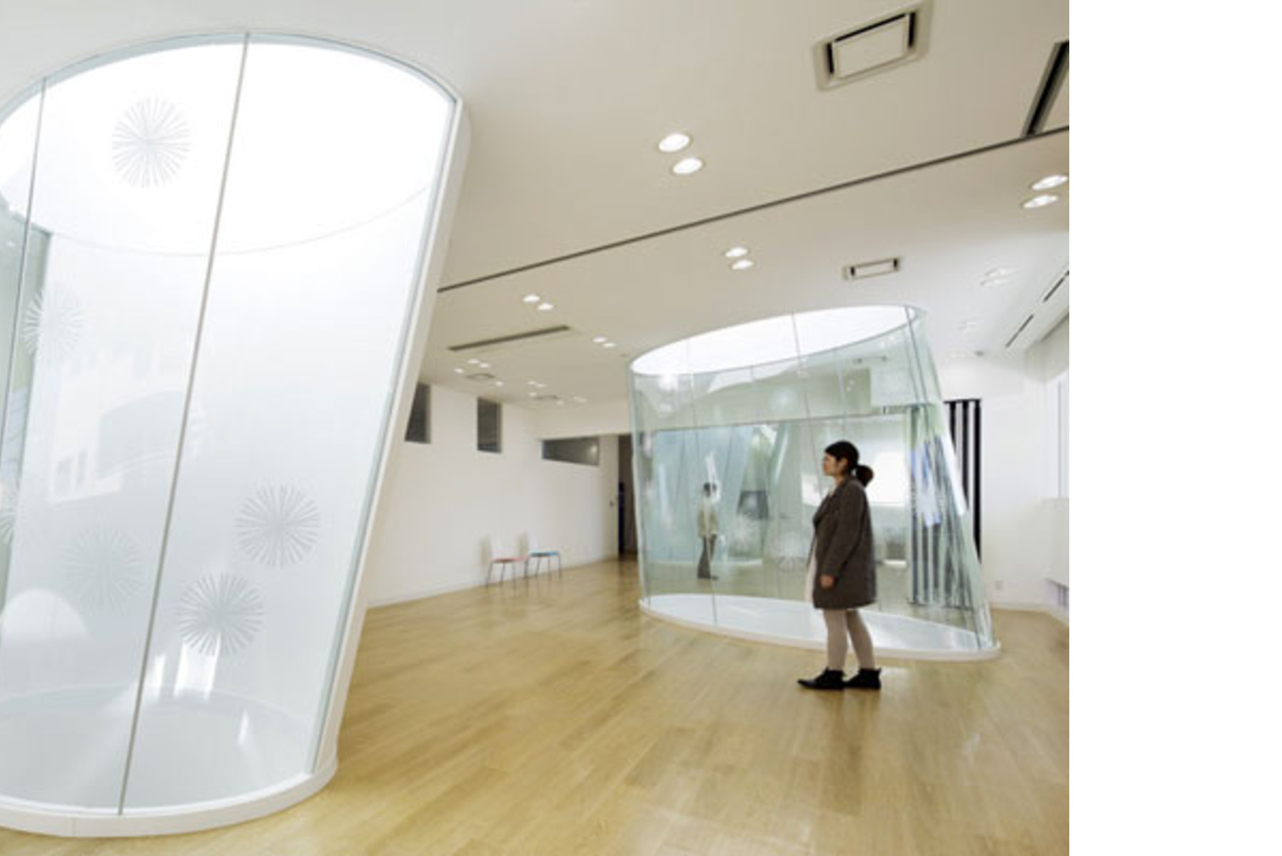
The building is located in a noisy neighbourhood, and the whole project is inspired by the concept of “looking up”, like the colourful planes on the façade which are visible only if you look upwards from below, or the three oval-shaped wells of light in the interior which allow observers to look at the sky and diffuse sunlight throughout the rooms.
Agnese Bifulco
Design: emmanuelle moureaux architecture + design
Location: Tokyo, Japan
Photographs: Nacasa & Partners Inc.
www.emmanuelle.jp


 Alfonso Femia - Redevelopment and interior design of the new Ersel Bank in Milan")