06-11-2019
Lombardini22’s FUD designs the new WakeUp Cosmetics store in Milan
FUD, a Lombardini22 brand, has designed a new store for the WakeUp brand based on an idea by Syrian artist Jamal Joratli. The architects have created a flowing, organic, brightly lit space that translates the brand’s essence into interior design, conveying a sense of energy and vitality and a new desire for beauty.


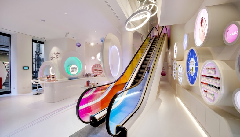
WakeUp, a brand based on an idea by Syrian artist Jamal Joratli, recently opened a new store in Milan. The store was designed by FUD Brand Making Factory, a division of the Lombardini22 group specialising in Communication Design and Physical Branding. The new store is, as the photographs by Studio Tettamanzi reveal, an explosion of colour, energy and vitality. The architects have created a flowing, organic, brightly lit space that translates the brand’s essence into interior design, conveying a sense of energy and vitality and a new desire for beauty.
FUD Brand Making Factory is one of Lombardini22’s six brands. Established in 2007, the group has become a leader on the Italian architecture and engineering scene, and comes first in the recent ranking of the
Top 50 Italian architecture and design companies in terms of turnover.
The WakeUp store in Via Torino in Milan is an excellent example of the way FUD works, acting in partnership with the client to define the needs and goals of the project and allowing the client to play an active role in the design process.
The make-up and accessories brand is based on an idea by Syrian artist Jamal Joratli and represented by the logo of a shining golden sun, inviting customers to discover their own natural vitality and beauty.
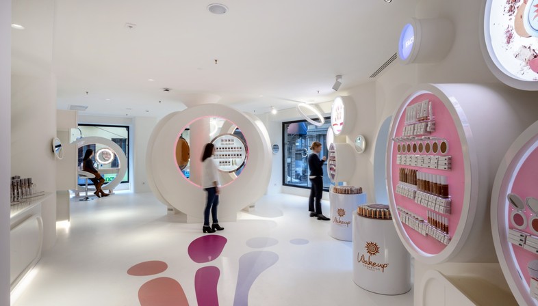
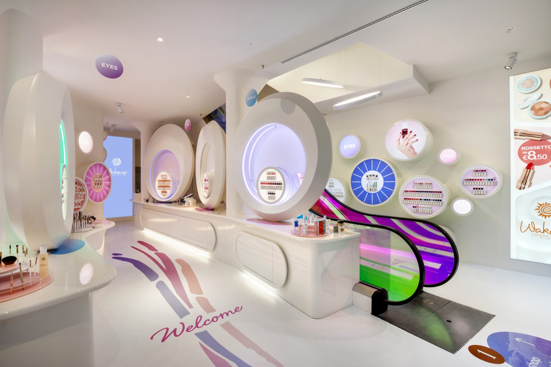
The design of the new store in Milan reflects this important message and the resulting shopping experience. Customers are guided along an immersive route through the harmonious curved spaces in the store to discover the brand’s products. The route includes areas designed for specific functions which add dynamism and permit participation, such as the lounge or the beauty bar area on the first floor where customers can test products, or the social area with selfie walls and photo booths.
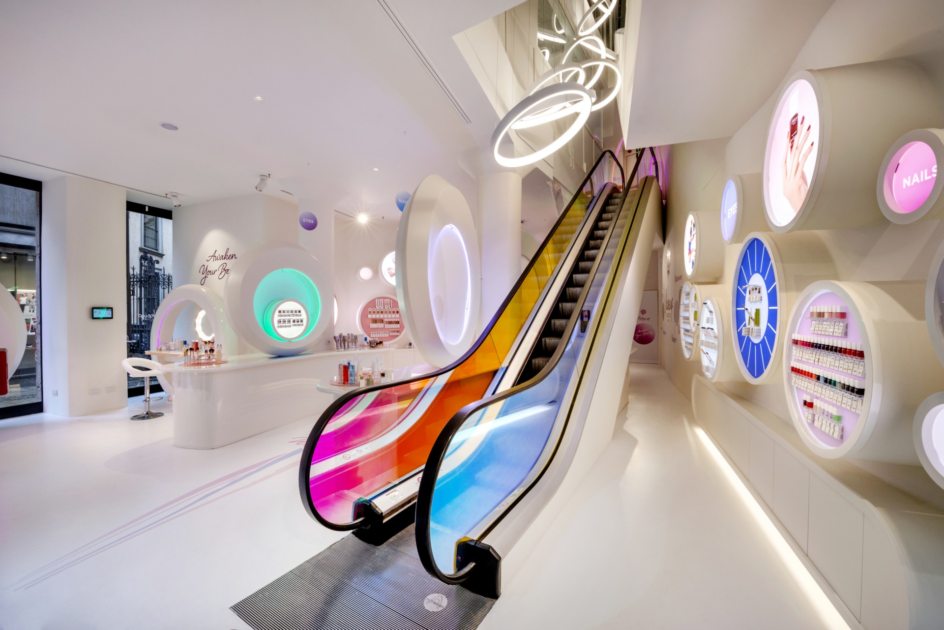
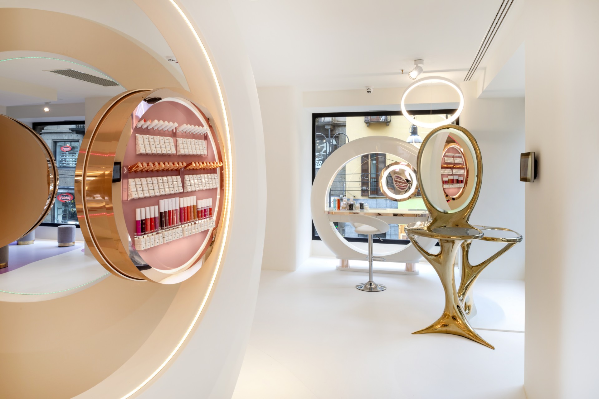
The architects have chosen pure organic shapes consistent with the design of the space for the furnishings and display units in the store. The common thread of the project is concentric rings and
a colour palette featuring iridescent hues ranging from pale pink to a brighter shade of blue, against the background of the brand’s trademark colour. The same effect appears along the strip of the escalator joining the two levels in the store.
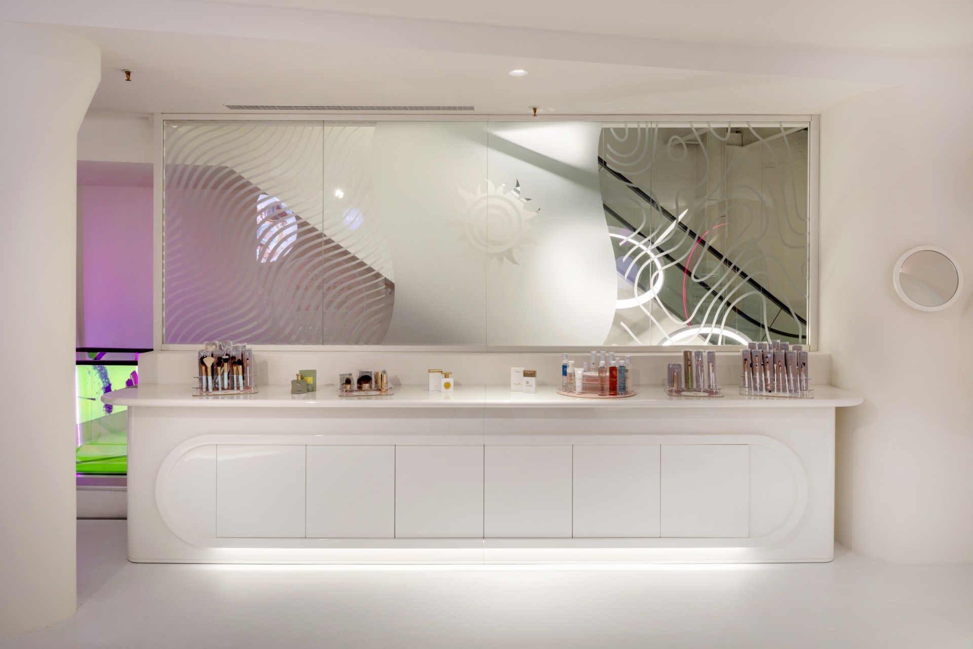
For the walls, the big central counter and the window display, the architects have designed special round backlit units in four different sizes used for display and advertising purposes.
These interchangeable elements are aluminium and plexiglass frames, some of which contain mirrors, while others are rings in different colours, forming easily reconfigurable elements conveying specific messages to customers,
such as new product launches or promotion of a particular product category. The visual language of the store revolves around these units. Like the shape of the spaces and display units, the signage on the different levels of the store picks up on the circular shapes characterising the store’s interior design. The whole helps to generate a very welcoming atmosphere for customers, while conveying a sense of enthusiasm and vitality.
(Agnese Bifulco)
Client: WakeUp Cosmetics
Interior design, communication design, brand identity, customer experience, wayfinding: FUD
Timeline: 2018-2019
Location: Via Torino 19 Milan - Italy
Total surface area: 750 sqm
Type: Retail
Photos: Studio Tettamanzi
lombardini22.it


LATEST FROM FLOORNATURE


Related Articles: Store

Related Articles: Studio Tettamanzi

Related Articles: Showroom

Related Articles: Lombardini22

Related Articles: Milan