05-12-2017
Creativity and freedom of composition: IRIS’s Be In and Wheat surfaces
Home design in 2018 rediscovers decorative effects in the pastel colours and textures of Be In surfaces, and in the uniqueness of IRIS Ceramica’s Wheat tiles with the look of lived-in wood. Increasingly personalised spaces with a creative touch are underlined with the glamour of classic hues such as rose and sea green, in timeless white, black and grey and in the warmth of wood effects


Pastel colours, glossy surfaces and lightly traced decorations: like home decor, coverings for the home in 2018 are all about rediscovery of classic colours and vintage hues, in relaxing, comfortable spaces that thrill us on first sight.
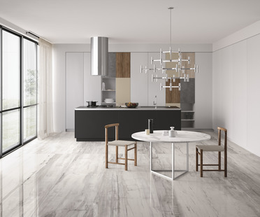
Colour continues to play a key role in floor and wall coverings for home design in 2018, even without the use of bold, bright hues.
It is the juxtaposition and combination of different effects and colours, of patterns and original details, that creates the most interesting, attractive, free and original compositions.
IRIS Ceramica expands its production of surfaces for the home, public places and businesses with collections such as Be In and Wheat rediscovering the attractions of gloss and decorative effects, starting with classic modular 10x20 (Be In) and 10x30 (Wheat) tiles.
Both collections perfectly reflect today’s tastes: customisation of the home, an emphasis on creativity, and the desire to rediscover romantic atmospheres, without giving up contemporary elegant style.
As in wabi sabi design, both collections underline the "beauty of imperfection" in details and effects: in the lightly traced decorations of Be In, and in the natural uniqueness of individual Wheat tiles.
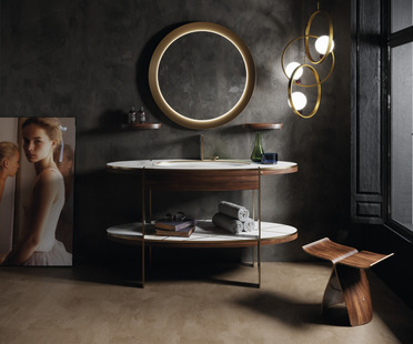
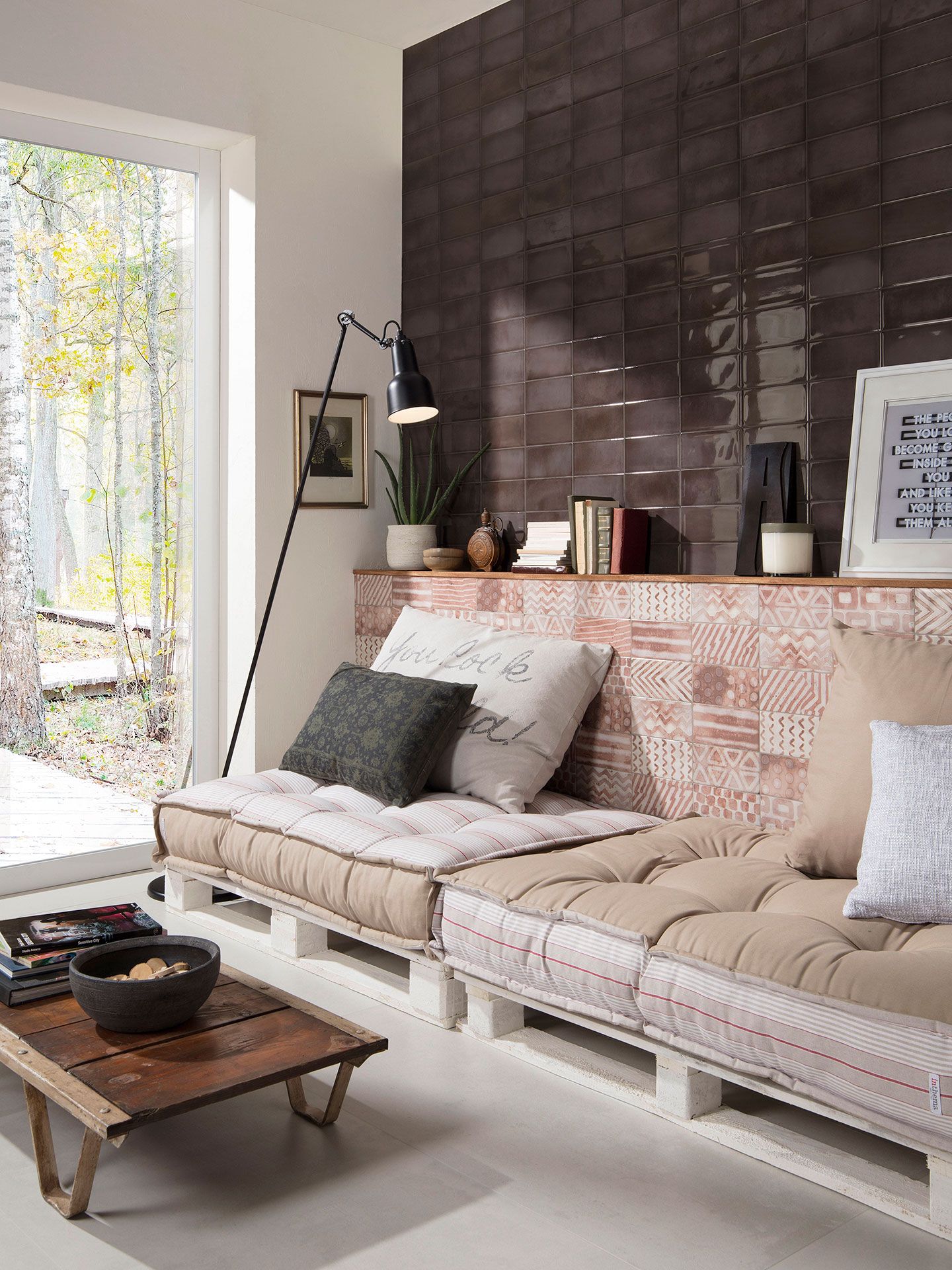
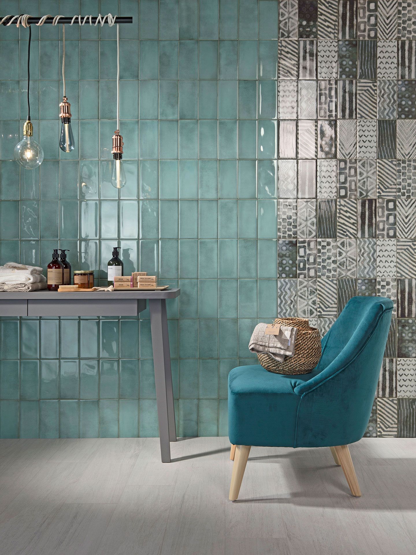
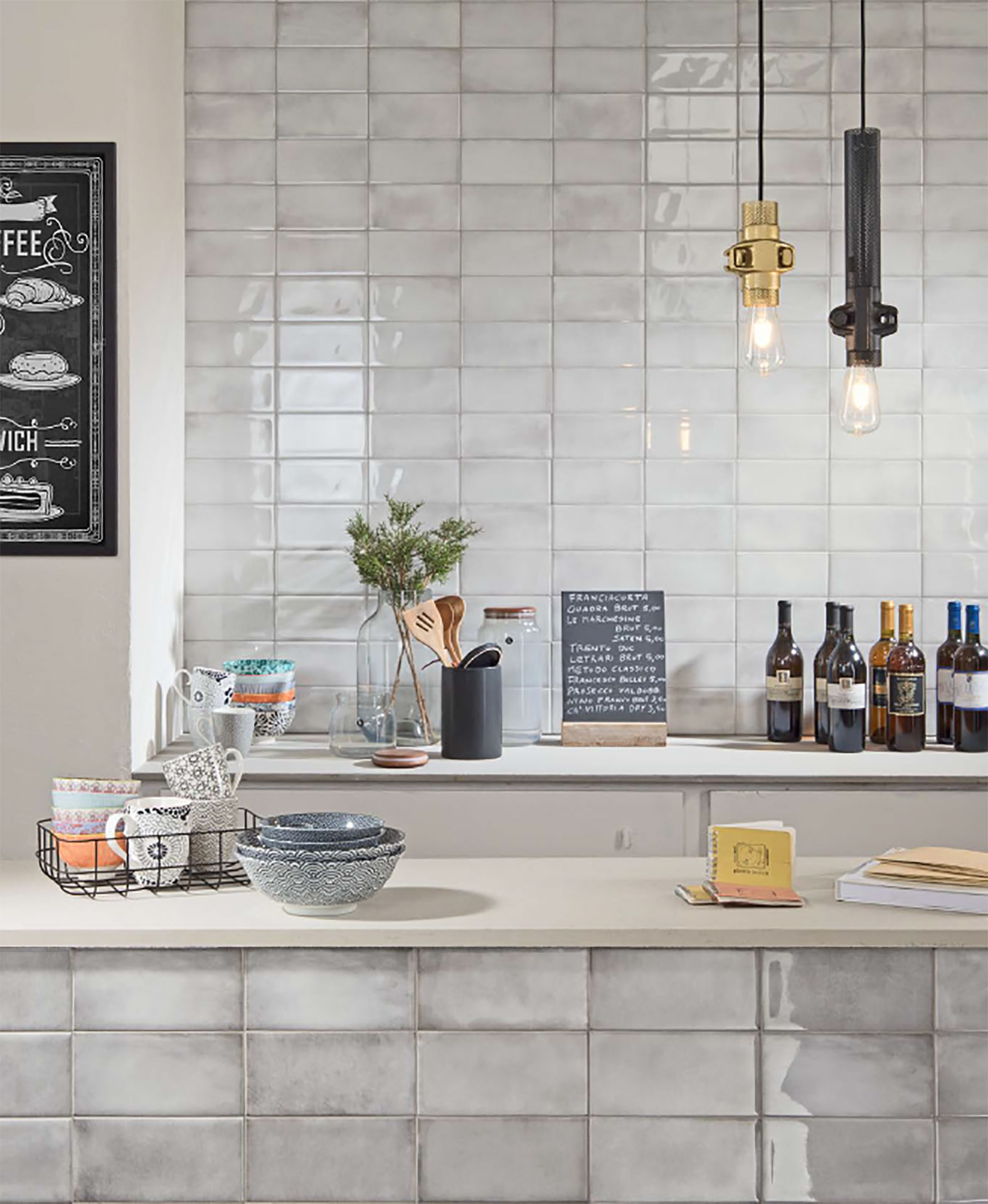
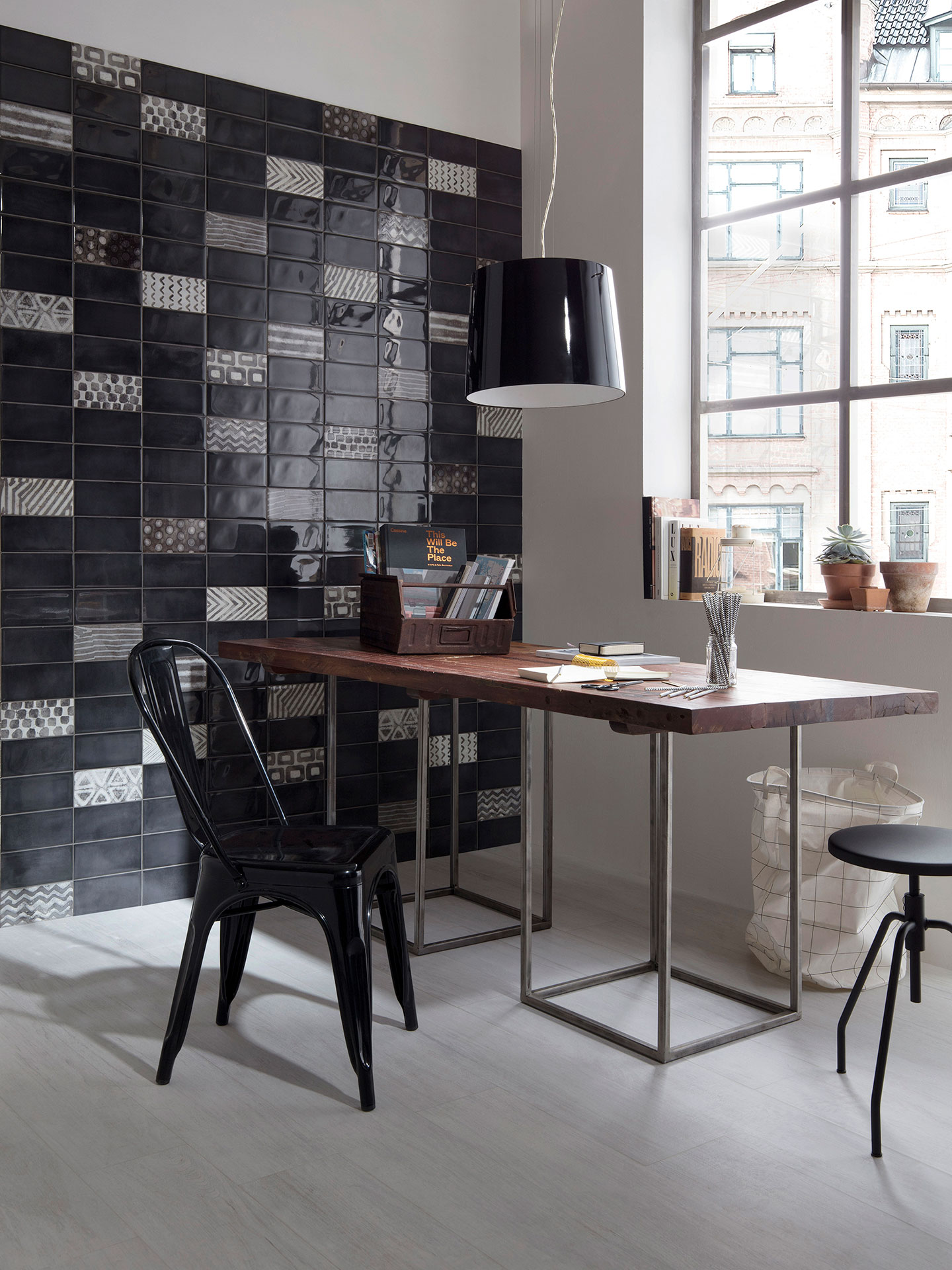
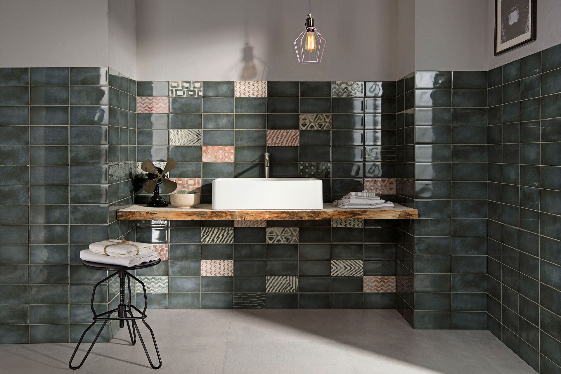
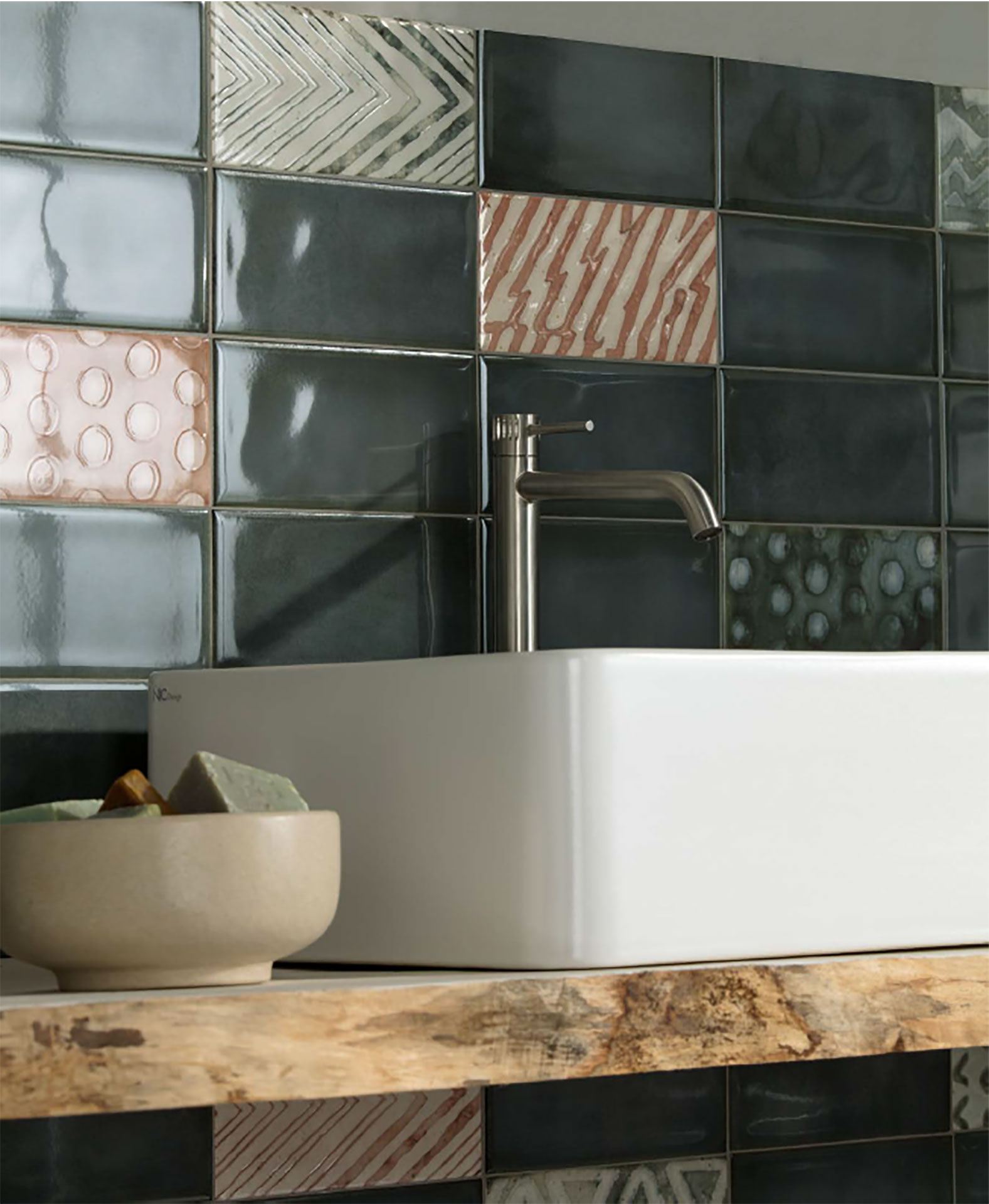
There is plenty of room for experimentation with colour, tone and gloss in the Be In collection of single-fired ceramic surfaces. The surface’s bold identity is expressed through rediscovery of classic hues (Rose, Turquoise, Greensea) alongside timeless White, Black, Brown, and Grey.
In combination with different textures, individual colours permit creation of truly fascinating effects, as revealed in the selection of images.
White hues "subtly hinting at grey are mixed with craquellé effects". The juxtaposition of Rose and Brown reveals "a modern mood, without losing that touch of bon ton romanticism". In the minimal look of total Black, the overall effect is broken up by the subtlety of patterns that brighten up spaces.
These are only a few examples of possible compositions, underlined by the ease of laying tiles measuring 10x20.
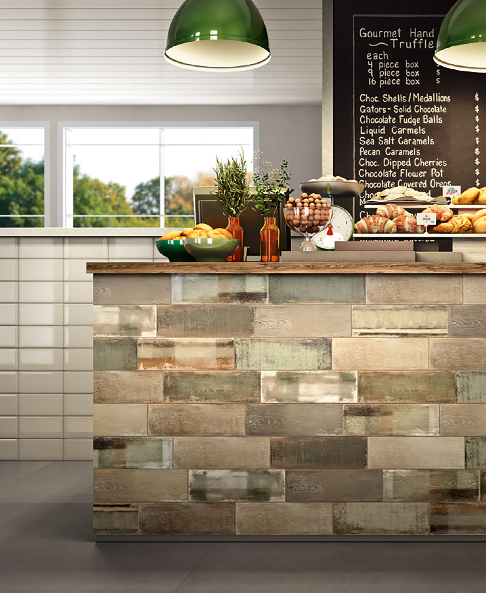
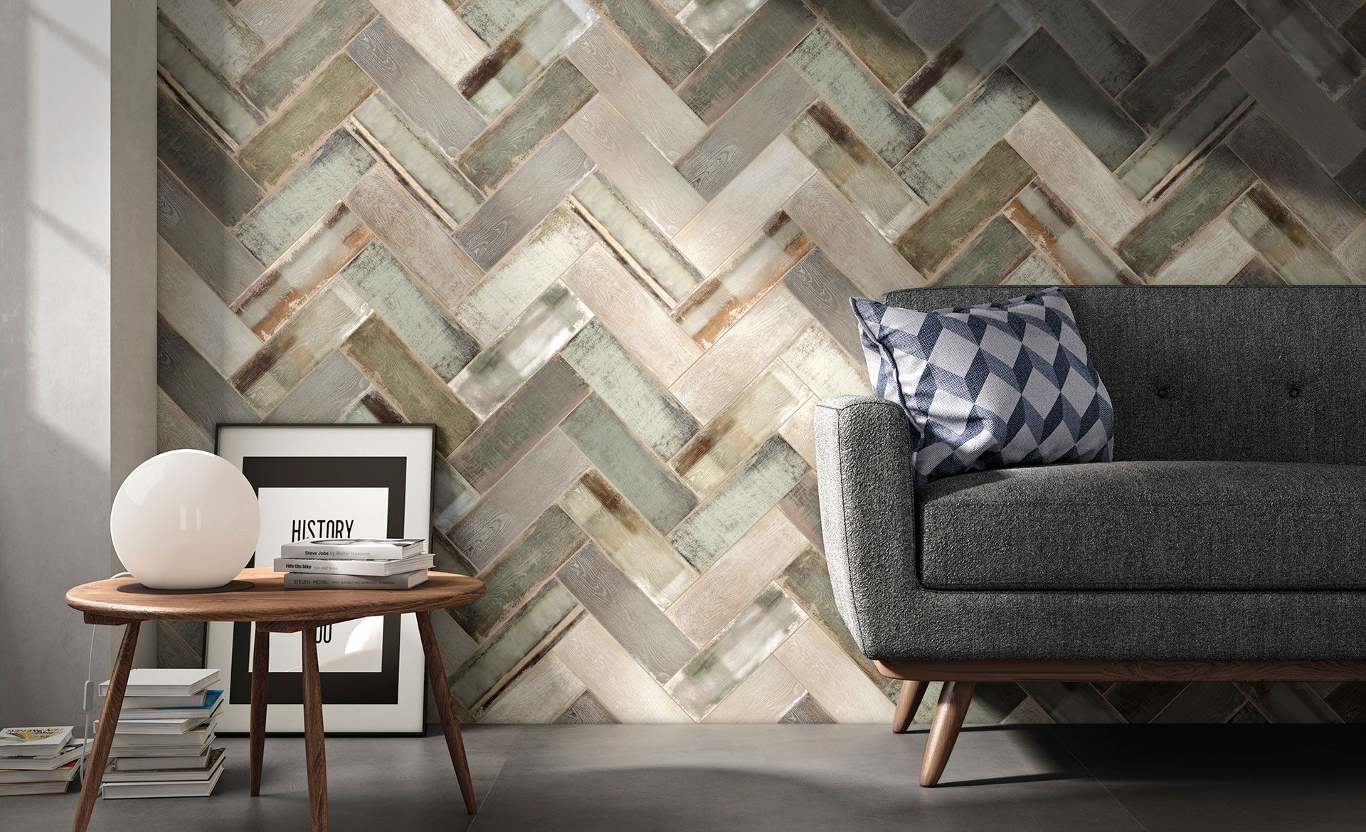
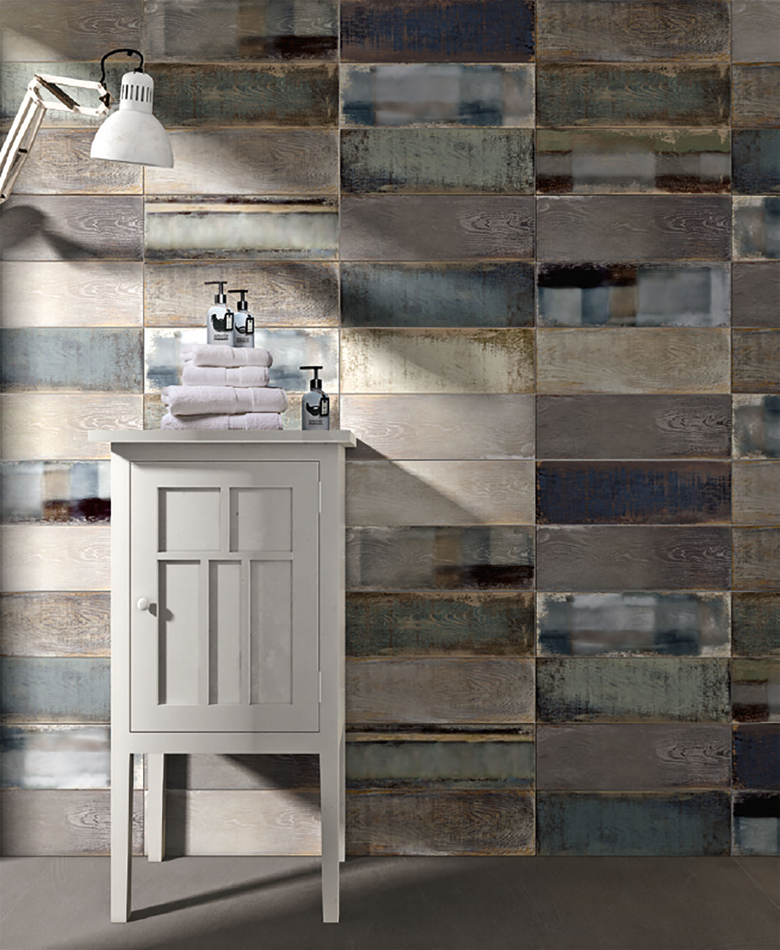
In the two colours Brown and Blue in the Wheat collection, spaces stand out for their unique, dynamic forms of rough, lived-in, scratched-up wood. Natural flaws and variations in hue, even in individual single-fired tiles, create surface coverings for warm, cosy spaces.
Marco Privato
LATEST FROM FLOORNATURE


Related Articles: Classic
Related Articles: Iris Ceramica

Related Articles: stile shabby

Related Articles: Porcelain Tile
Related Articles: stile vintage

Related Articles: Wood