The colours of porcelain stoneware are in harmony with the different approaches to design of architects, interior decorators and environmentalists: the colour of ceramic surfaces as a possible key to interpreting contemporary architecture.


Contemporary architecture is dominated by three main currents of thought: one which makes every space the scene of a mood, as an individual response to the new decorativism, another which sees construction as a metaphor for the correspondence of form and communication, making a building a symbol of a place, while the third brings man back to nature in a new dimension of sustainability. We may identify certain constants for each of these macro-groups.
The first current seems to be followed by those architects and designers who see space as an opportunity to generate visual effects by layering structures, covering materials and furnishings. Those who belong to the second current generate space through virtual modelling before building it in reality: a proceeding that produces a budding of forms that might be used either for a table or a library, in that their primary function is communicating, on any level, under the rigid direction of a thoughtful designer.
The third current is that of the architects who choose to leave behind the communicative and symbolic clamour of big public projects to promote a new philosophy of living: man and nature in the centre of a new harmony. The result is buildings that are respectful in every way, that sit almost timidly on the land, with a fascinatingly fleeting character.
The three aesthetics have a lot to say about who we are, how we use land and our relationship with it and the city. They are a recognisable set of three, each with its own vocabulary and symbolism, in which every architect’s work seems to declare its adherence to an aesthetic view of the world.“Taste is the only interpreter of our day”, the first current seems to say.
“Form, content and communication: the triad of this change of millennium”, says the second current.
“Everything is temporary: it comes from nature, and will go back to nature”, blurts the third current. Leaving behind the critical judges and individual choices, from our point of view, it’s interesting to see that all three represent our times, especially when they are mixed together, and to see how they suit specific colour choices. Followers of the first current seem to like all forms of colour, while the second are interested in the spectrum of greys and beiges, and the third group draws on the hues found in nature and natural materials. This perspective reveals precise aesthetic and chromatic rules, in that use of colour is also a matter of taste and is identified with a particular period in history.
On the basis of reflections of this kind, the companies themselves have diversified the colour palette offered for indoors and outdoors, putting all the technical performance of porcelain at the service of colour.
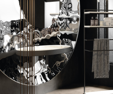
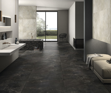
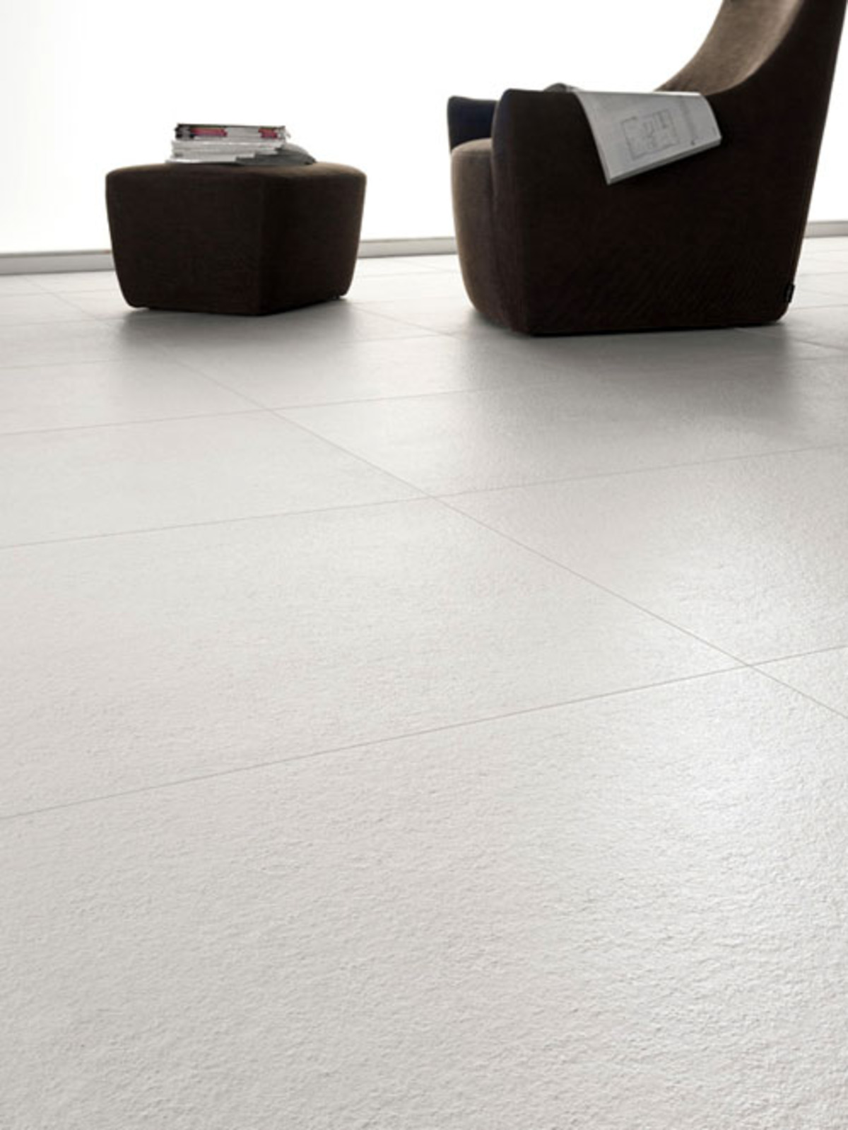
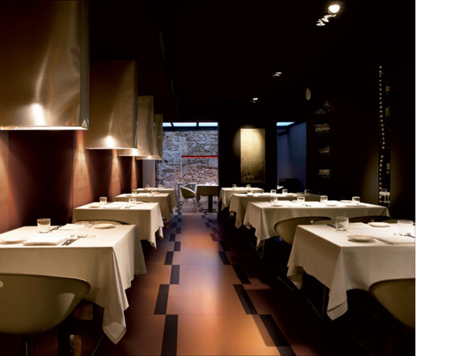
Just think of the chromatic effects and chiaroscuro offered by Ariostea in its Iridium series, in which colour and visual effects blend perfectly with the architects and designers’ aesthetic to finish spaces in bold colours that keep up with the times. Or the Just series made by Porcelaingres, in which variations of grey and beige seem to be designed specifically for spaces with communicative power, in a chromatic system in which the archistars can find symbols to complete their creations on various different scales.
While the third aesthetic current, the one that sees nature as the only colour palette to draw on if one is to be declaredly environmentally friendly, is clearly expressed in Ariostea’s Greenstone collection, in which the colours of nature are used to cover a perfectly eco-friendly material at the service of environmental, social and economic sustainability. This LEED and BREEAM certified series matches the company’s choices with the aesthetic preferences of architects who wish to clearly state the fact that everything comes from nature and goes back to it.
As always, choice is an individual matter, and there are, luckily, differences in taste, giving form to our complexity, though it’s interesting to note that even a choice such as the colour of a wall or floor covering is part of a whole system of expression that design allows us to hand down to posterity.
COMPANIES MENTIONED
ARIOSTEA
PORCELAINGRES


LATEST FROM FLOORNATURE


Related Articles: Porcelaingres

Related Articles: Ariostea

Related Articles: Porcelain Tile