Colours created with Ariostea’s Iridium porcelain tiles underline creativity indoors and outdoors: a designer product that responds to all the needs of contemporary architecture


In today’s many different aesthetic styles, use of colour remains a constant which, depending on how it is used, identifies architects and designers’ philosophies, visions and personal tastes. Technology permits creation of materials featuring blends and clear separations, chiaroscuro, gradation or saturated hues, particularly in porcelain, the perfect product for covering floors and walls.
No colour is precluded, and every shade identifies a design representing ourselves and our approach to the city, urban territory and the natural landscape.
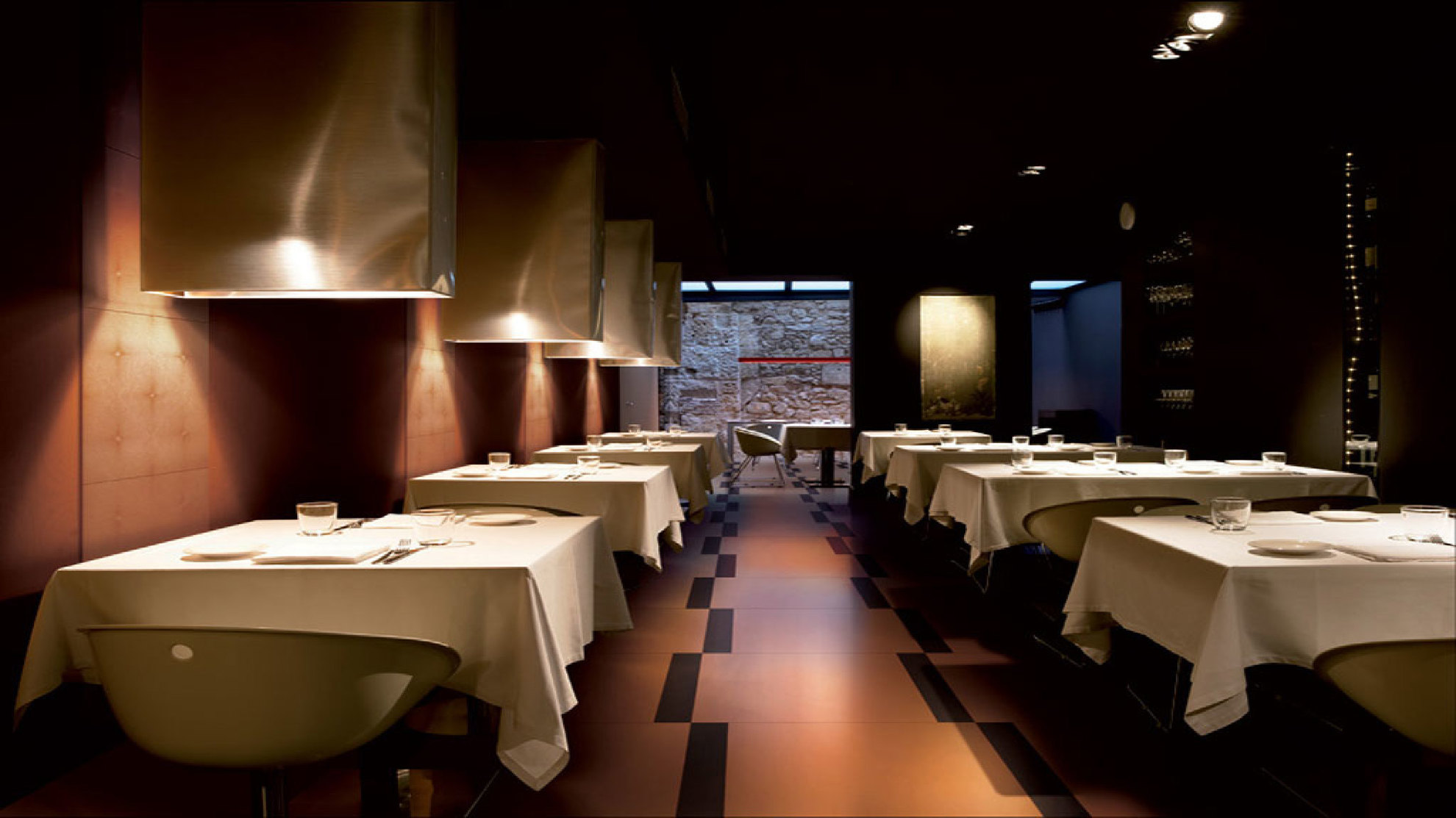
Colour is a primary element of communication: now more than ever, we use colour preferences to create atmospheres in residential spaces, focus attention on commercial spaces, and determine mood and psycho-physical wellbeing in public places, restaurants and leisure facilities.
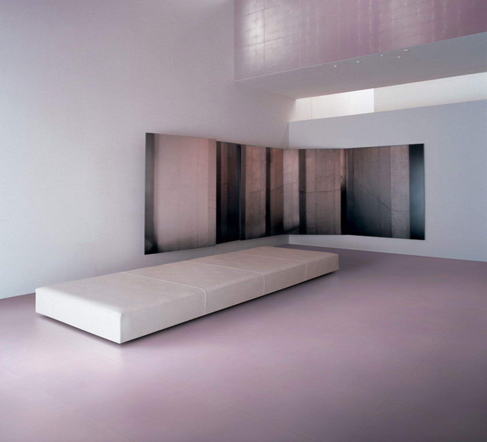
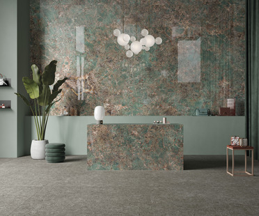
Architects and designers use the colour palette of porcelain to offer the broadest possible choice of indoor and outdoor flooring materials, as is evident in the collections offered by Ariostea. Iridium is a collection of porcelain tiles and coverings combining quality, expressiveness and technology in a single product with a focus on colour, which "dominates in vibrant psychedelic hues and refined natural shades inspired by plant life".
Iridium is a fascinating line of innovative high-tech porcelain tiles: 12 bright colours (Orange, White, Blue, Brown, Champagne, Yellow, Grey, Black, Red, Sky, Green, Violet) are presented in four variants ideal for all kinds of floor and wall surfaces.
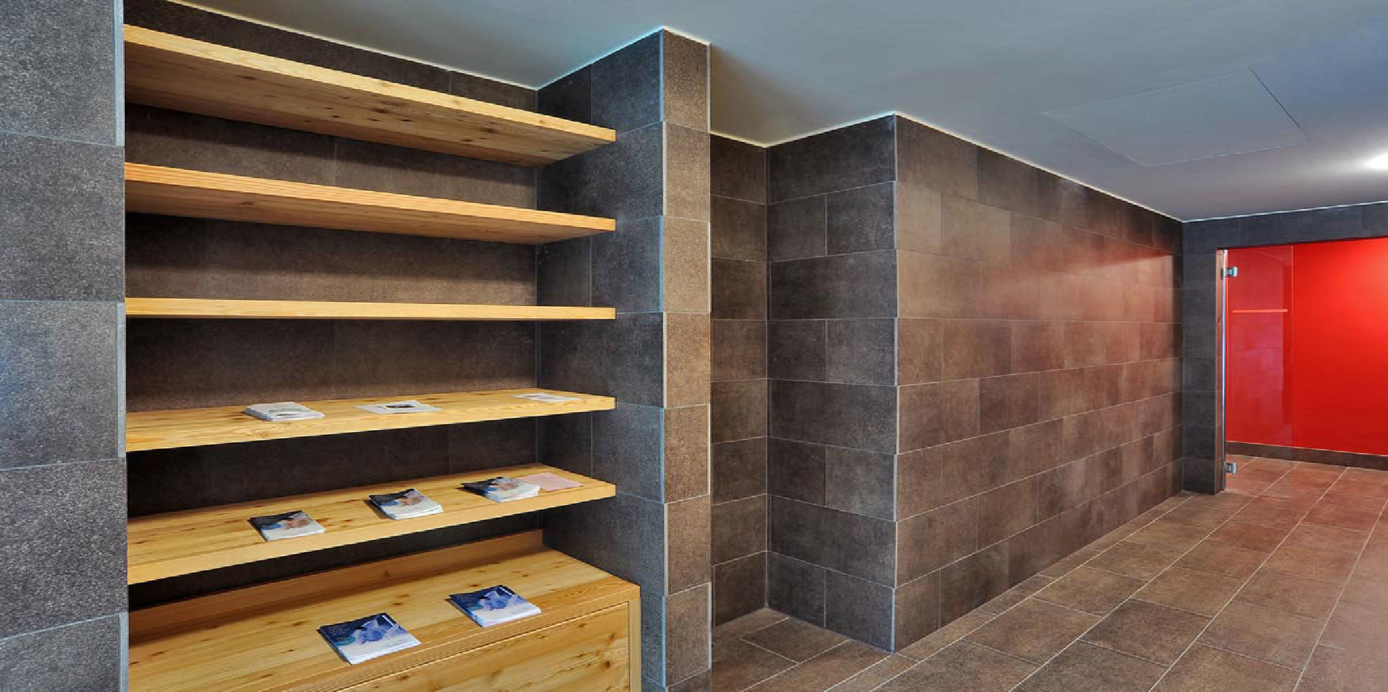
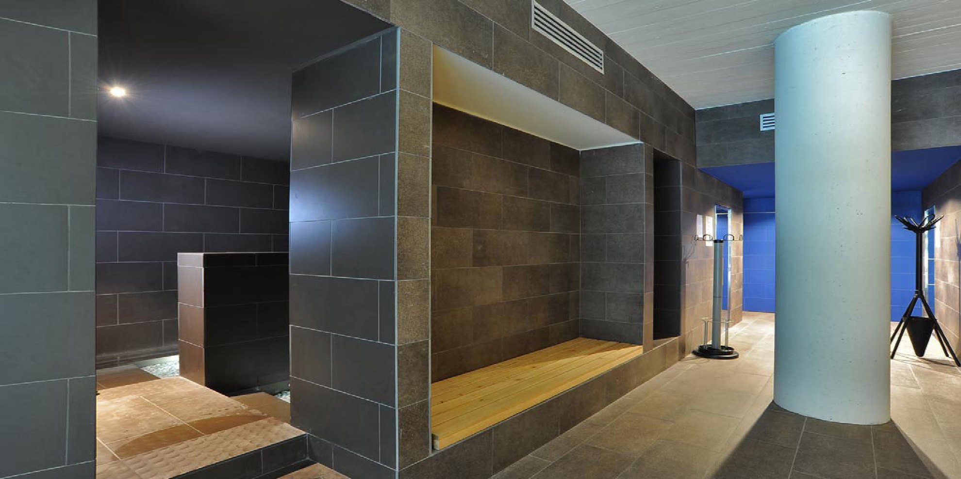
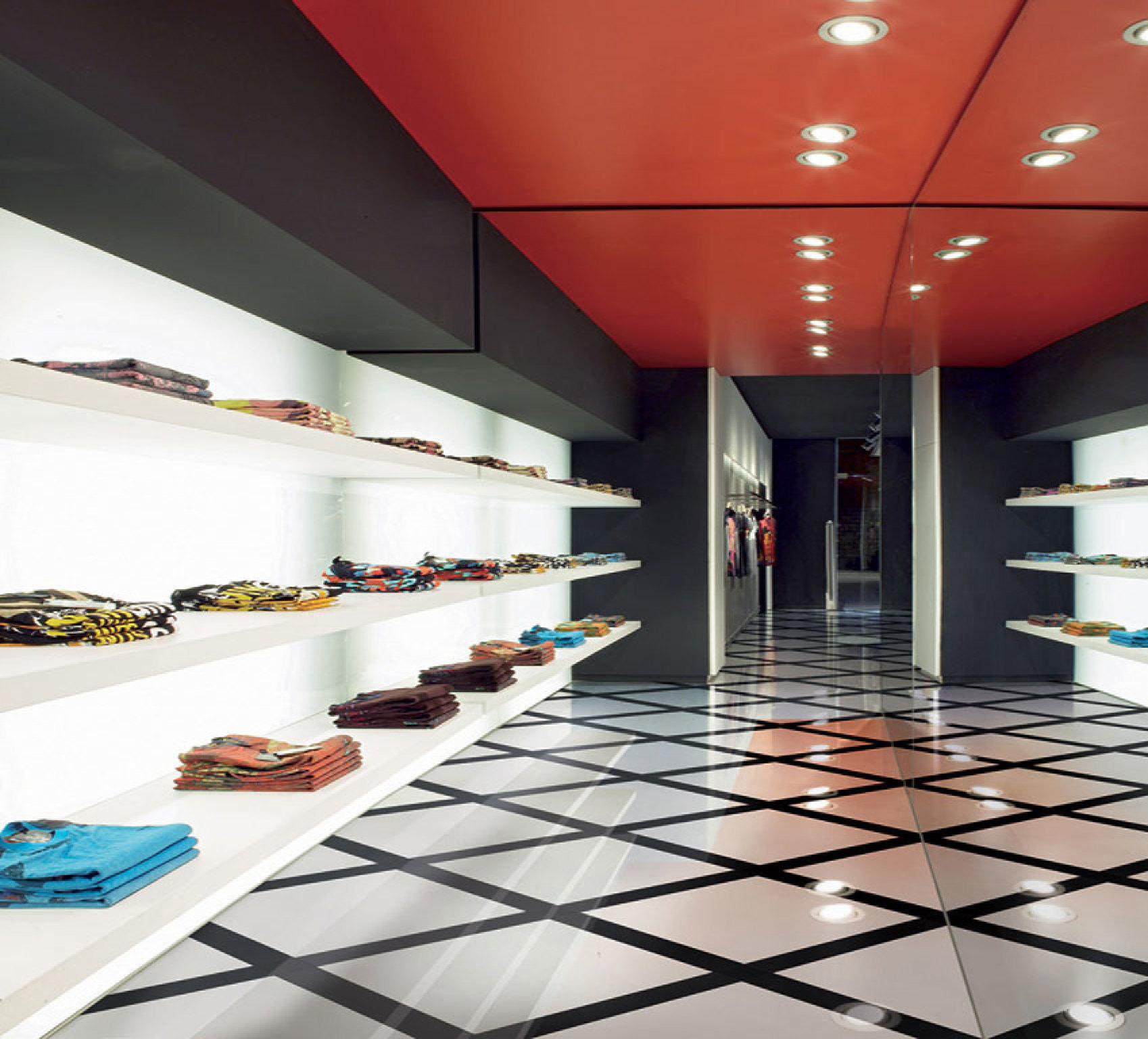
The product is highly versatile for application in a great variety of different settings, as revealed in Ariostea’s projects, ranging from school campuses (Tressano, Reggio Emilia) to stores (WE Shop in Nijmegen, the Netherlands and Casa Anversa, Messina); from Spa & Wellness (Kempinski Hotel Adriatic, Umago, Croatia and Arta Terme, Udine) to bookshops (DZS Bookstore in Ljubljana, Slovenia).
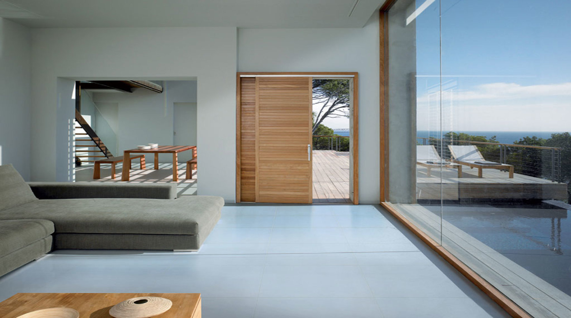
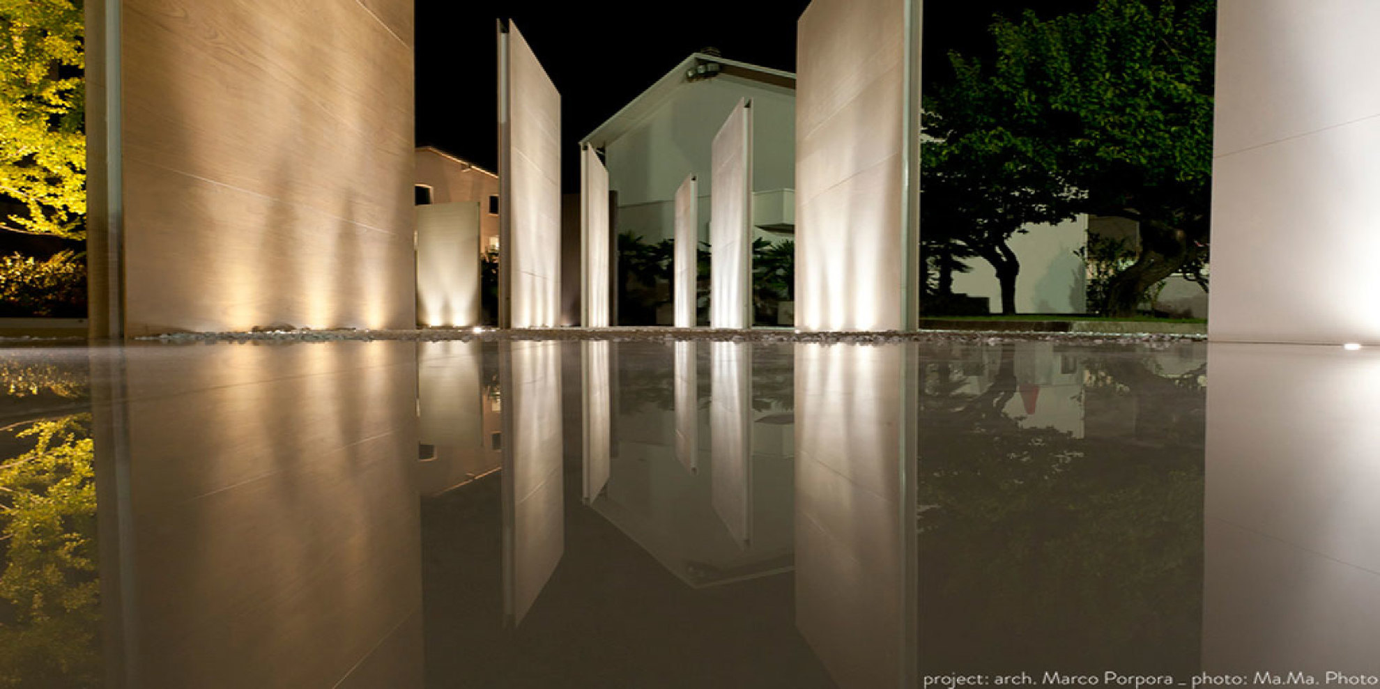
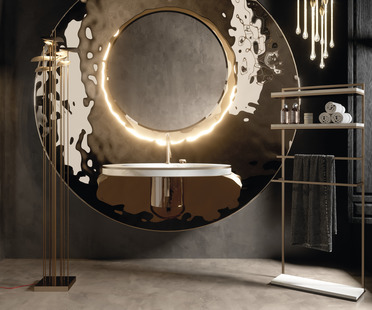
In residential projects, Iridium’s colour palette is best suited to the warm, cosy atmospheres of interiors, but it can also offer inspiration for achieving visual continuity between indoors and outdoors. One significant example is the walkways, poolside area and outdoor flooring in the Hotel Hilton Garden Inn in Matera (arch. Giampiero Latorre), employing other classic Ariostea colours from the Paonazzetto S and Green Quarzite lines to create a fascinating visual contrast with the green area.
Marco Privato